Dots, Damien, Dylan and Diversity in Art

http://www.nytimes.com/2012/01/13/arts/design/damien-hirsts-spot-paintings-at-gagosian-in-eight-cities.html?pagewanted=all&_r=0

The real art critic lives up there in that link to the NY Times art page, and in this instance is writing snottily about Damien Hirst as successful Dot entrepreneur (Many, many millions of dollars worth of successful entrepreneurship, see above article)

The pretend critic writes the rest.

I am writing about Damien Hirst because he had agreed to be in the IMPRESS Printmaking Festival in the area of Stroud, Gloucestershire, England. Below is what Damien exhibited at the Pangolin Foundry (where he has stuff cast) and Gallery:

The Gallery published this (below) exclusive limited edtion etching of Hirst's working drawing for “Away From The Flock” , one of his celebrated controversial works. Presumably the title refers to the artist himself. One could make a lot of guesses related to that basic proposition, that Damien Hirst does not run with the herd…Though some would call him a Black Sheep because he makes too much money as a living artist for the Art Establishment's liking. Those art critics and gallerists like their art revolutionaries tame and eating out of their hands, I think. And they love it when you stuggle financially and reputation-wise so that you have to co-depend on them…

Hirst's thousands of “Dot” paintings (reviewed above in the NY Times ) are interesting enough in an “art studio exercise” way. Hirst's assistants were instructed to paint dots but with no repeated colours. Spaces between were equal to the size of the dots. Different canvases had different sized dots but all dots on a canvas were the same size.

Now here again is my grandson Dylan's “Dots” art:

I drew a link between Damien's Dots and Dylan's. When Dylan was learning his first words around the age of 15 months, he enjoyed looking at the red portulaca flowers in my front garden. He would touch them and kiss them. I would say “flower” and he would say the word back, toddler-style. Summer passed as did the portulaca. One winter day, some months later when the sun was low in the sky, a shaft of sunlight passed through a piece of red stained glass hanging in the living room window. A patch of red light fell on the wood floor. “Flower”, said Dylan. I thought of Monet who said when he painted nature, he looked not for a flower (for example) but for the patches of colour that made up the flower as assigned by the light – over which Monet had no control. Can we look at Damien's dots and see them as patches of colour, formalized, to be sure, assigned to their precise place on a canvas by an assistant not by nature? Either way, the artist gives up control.

Here are more art works of many kinds encountered on that trip:

Chihuly at the V & A

Jane Henriques at IMPRESS: “Pounce!” This elemental piece is full of vitality. ( No fox hunting allowed by hounds anymore in the Cotswolds, BTW)

I took this photo through the glass of the Thames tour boat. Did you think it might be a Canoletto?

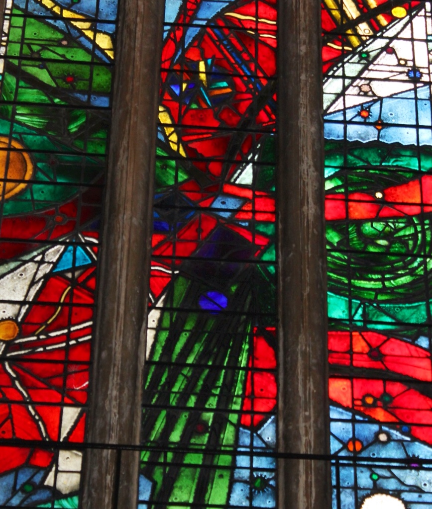
Modern stained glass in Bristol Cathedral. Many of its windows were destoyed in the Nazi bombing of ports during the 1939- 45 war.

A much-loved naughty painting on a wall downtown by Bristol-boy, Banksy.

Porcelain bells sculpture by….? Sorry I have lost the reference (if you know…)

Examples of famous British liturgical textile art. One of many kneelers needlepointed for the Lady Chapel with scenes from the life of the Blessed Virgin Mary – an embroidered-cushion rosary.

The Cloisters of Gloucester Cathedral in Gloucester, venue for the keynote “IMPRESS” exhibit “Red Ink” that dealt with slavery and human freedom as the overall theme

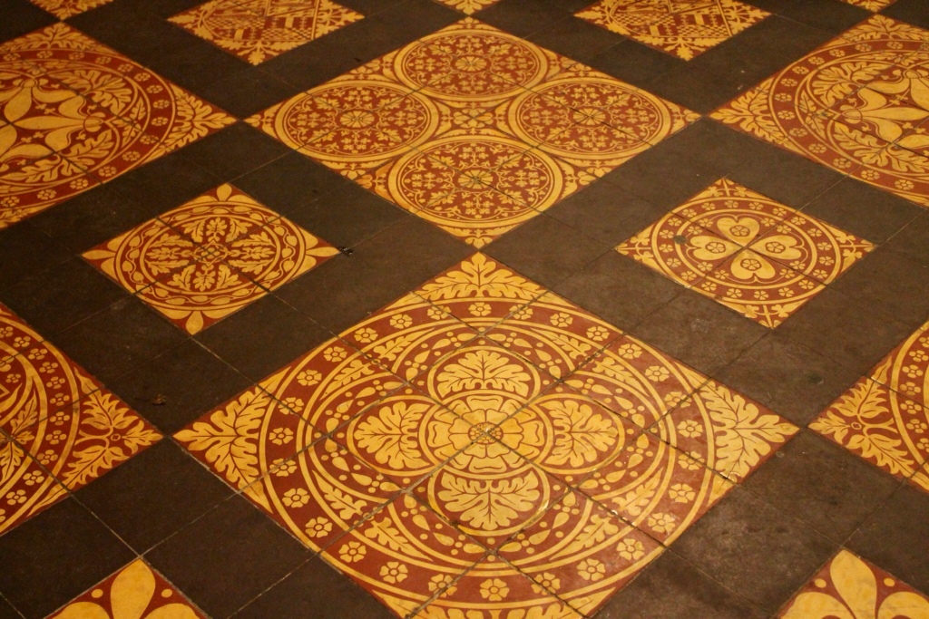
Floor tiles in Gloucester Cathedral

Another Damien Hirst work , this one at the Tate Britain. Ash tray on a table with a pack of cigarettes, inside a large glass case.

Kurt Schwitters, father of collage, at the Tate Britain. Schwitters used a precise formula for placing his scraps to make the collage. He deemed all materials of equal value in the making of an art work, and that it was therefore possible to combine any elements for artistic purposes. No more the primacy of paint, said Schwitters. In this respect, his thinking is in line with Damien Hirst's who further asserted that it was the complicity between artist and viewer that led to a work's designation as “art”. If each agreed that faith was required…

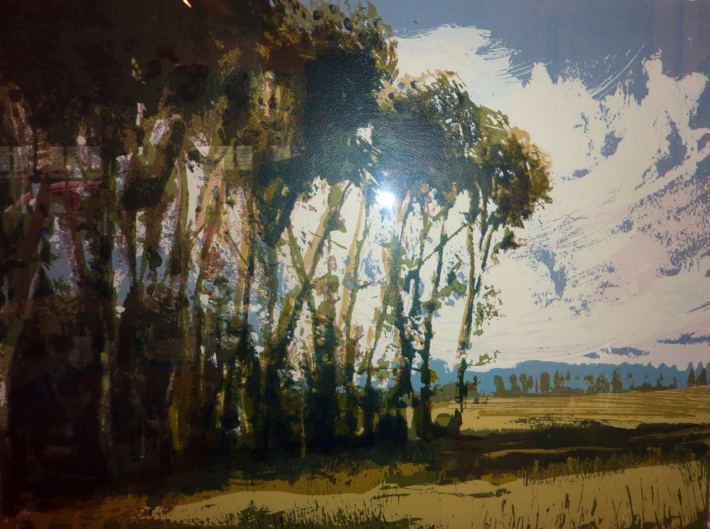
Next, there is Turner (at the Tate Britain) My favourite artist, really

And some close ups of his canvases, below

From IMPRESS again:

Terence Millington, member of the Gloucestershire Printmakers Collective, exhibitor at IMPRESS and frequent contibutor to books about painting and printing.

The Ottawa Gatineau Printmakers Connective exhibit at the Corinium Museum in Cirencester. Clockwise from the left on the poster: Leigh Archibald, Lynda Turner, Mary Baranowski Lowden

My Artist Book “Botanica: New World Scroll 1” with Clamshell Case by Shlomo Feldberg. At the Corinium Museum, Cirencester.

Still Life With Wellies ( My photo at the door of the barn)

At Arabella's Barn Gallery near Stroud (IMPRESS venue)

Low tide on the Thames near Saint Katherine's Dock, East London

Mouse Performance Art/Sculpture on our dishwasher. Performance staged while the Cats were away. Disgruntled mice with a huge sense of entitlement ate through the pump of the dishwasher in search of possible food lodged there. Additional performance, with sound effects, when dishwater drained onto Husband in his basement workshop…

After the flood, we wanted to make a sculpture like the one above (shown at IMPRESS), a la Schwitters, with our waterlogged art materials…

Goodbye, England. Until next time. (Photo taken from Thames boat)

Last post from the Cotswolds next time. About the plants and other country beauties


Wendy

Eco Print Fest!

Today's post shows more experimental prints made by students during the recent IMPRESS '13 International Print Festival. But first, a few thoughts in which to situate the sharing we can choose to aspire to as art bloggers. In the Foreword to the festival catalogue, internationally esteemed British painter /printmaker Hughie O'Donaghue remarks (with admirable humility, I would say, for this guy is a Big Wheel in art):

The fine art print is constantly changing and developing and it is a medium that is advanced by dialogue and exchange. Unlike painting, which is very much a solitary activity, printmaking often takes place in a social environment where artists gather together to share equipment and facilities and, as a result, inevitably exchange ideas. This dialogue is something I have prized in the various print studios that I have worked in over the years in Italy, Ireland and Great Britain.”

Here is some more work by other accomplished printmakers who participated in the festival and who also became students of eco printing:

An oak leaf: rust and logwood powder over …something yellow (no label…)

Eucalyptus (L) with iron modifier producing black outlines. Source of the blue? Could be juniper berries or bits of Red Cabbage.

Rectangular cuts of metal rusted with vinegar, printed on silk tissue, with Red Cabbage

Brushing on some of the dye modifiers, postprinting. Note the conscientious labelling!

Carrot tops (yellow-green) and logwood with a tad of Red Cabbage (blue), with colour mixing

Red Cabbage and kale

Metal pieces, rusted with vinegar, with dye powders on accordion folded watercolour paper. Much colour mixing, especially in the folds of the paper.

Sage and eucalyptus (L) modified with iron (R). Note the well-filled notebook (L)

Adventurous collection including juniper, Cow Parsley, nettles – modified with iron liquor (L) using a fan brush – giving the effect of raking light.

Sumac (pink), nettles, R.Cabbage et al, i.e., colour mixing taking place.

Turneresque euca with iron. Pigments leaked through from the prints on the back of the paper.

Lovely. Nettles? The green, centre. Rose leaves (L). R. Cabbage and sumac berries (R)

Euca, R. Cabbage and madder powder

Just vinegar and metal pieces on silk tissue to give a rust print

Rusted metal with plants and string resist. The shiny patches that look white are rust

Beautiful wash of colours. By now, can you guess? Colour mixing here is wonderful.

Another view of one shown in the previous post. Sumac and berries- juniper? mistletoe? Acorn cap?

On silk organza ( for chine colle) – ??? plants with string resist.

Crocus blue, mint yellow green, sumac pink

A repeat from last post – I remembered that this was a rose petal and not a rose leaf modified by iron to give dark shades

Here are some prints drying on the rack. Great to work in a real print studio!

While we were in the studio eco printing, Andy Lovell http://www.andylovell.com of the Gloucestershire Printmakers Collective and a participant in the festival was screenprinting up a storm on an adjacent bench. Here is one of his wonderful screen prints:

Not sure of the title. Would like to call it “Mine” . It calls to my mind the landscape of the Cotswolds, anyway.

..as does this landscape by Constable (seen in the Tate Britain)

…and this, my own photo of the Cotswolds looking over to Wales. Talk about “green pastures”…sigh….

More about the artists in the festival next time – including Damien Hirst! Subject of many debates, as is only proper for art…

And bearing in mind Damien's “dot” paintings – here, to finish, is how my grandson, Dylan, appropriates dots as an art medium:

Why stop at Red Dots?

And why stop at the hand as canvas? And why not include stars?

Best

Wendy


A Rainbow of Eco Prints at the IMPRESS International Printmaking Festival

Home to freezing Ottawa from the equally freezing Cotswolds… finally sorted through the thousands of photos and picked some for the blog…It was the coldest March in 50 years in England – snow, sleet, rain, wind…Dire warnings about severe weather (several snowflakes were forecast) ..but who cares? It was a fabulously creative time in the Master Class on eco printing on paper.

The hoped-for foraging was meagre since few plants on my long lists (see Refs pages) were actually available for the gathering from the fields and gardens, given the late spring. Nevertheless, hotel fridges, Tesco, Waitrose, lay-bys, street weeds, hedgerow stalwarts and students' own gardens still provided all we could possibly want for our foray into eco printing on paper. Cousin Pam from Yorkshire even drove down with a “boot” full of eucalyptus, laurel and hydrangea trimmings from her garden; sage, mint, kale, Red Cabbage and carrot tops from Waitrose, roses too and early quince blossoms. From the Stroud environs came blackberry tangles, snowdrops, crocuses, celandine, cyclamen, dried beech leaves, ivy, mistletoe, nettles (barely up but plentiful), juniper berries, barks, mosses and mystery leaves galore…and oak leaves foraged from a galvanised iron drinking trough, all ready rusted…

See now what we printed with all of these (and more) We also had some painterly post-printing brush play with dye assistants/colour shifters like ammonia, iron liquor, copper sulphate and cream of tartar. Just a selection in this post – more to come (and lots already on FB). These, plus dye powders from Couleurs de Plantes, a selection of dried dye plants like sumac berries and black tea, copper pipes, iron bits and various barks all contributed to the rainbow of colours we obtained.

I was very happy with the results my students were able to achieve – first time for most of them. We worked hard and tried everything! Such an adventurous group. We had no time in one short day to let the first bundle rest longer than the lunch hour! The first batch of papers were pre-mordanted with alum as is my recommendation while the second batch had no alum soak (no time! ) but then we were experimenting.

Through the steam from the pot…the first reveal…

Eucalyptus, rose leaves, logwood dye powder, iron modified, in a steamed stack of papers. What can you say? So very lovely.

Sumac berries, logwood dye powder(?), some greenery, iron modified. Simmered in water, “Canal” paper rolled over a wood dowel (or was it a copper pipe?) This method of processing gave highly textured surfaces to the paper and induced pigments to pool in the folds where the fibres were bruised by the rolling.

Mystery (to me) leaf modified by selectively painting with iron liquor (rusty nails in vinegar or ferrous sulphate powder solution) Blues likely from the very co-operative Red Cabbage, greens maybe from rose or nettle…I did give each student a sheet of labels to attach to tne papers and to record the plants used but I did not photograph the label for this one from Bernard (I think)

Water colour paper, accordion fold with pockets , iron bits, dye powders, Rec Cabbage et al…spectacular rust and plant dye print by fearless printer, Maxine Relton.

Eco print on silk organza (I included some silk in the kit along with papers for chine colle experiments) Not sure of the plants but the result is delightful.

Cousin Pam's Ilkley Eucalyptus with Madder Rich dye powder . Isn't that an inspired colour pairing? Love the wash effect of the dye powder (which could be painted on like ink as well as sprinkled as powder)

Rose leaves and quince blossom – on the left, first print; on the right, painterly touches with iron liquor to bring definition. Lovely effect. As Kate said: “The iron brings it all to life!” Indeed it does here, while still retaining, not overpowering, the character of the original colours

A wonderful range of colours and forms in delicious harmony. A colour and value study.

More printerly prints next time. Thank you for your good wishes

Wendy