I stART the year..

…by looking back! Small wonder the god Janus is conceived as two-faced: with one face that looks back, the other that looks forward. So to look forward, I start from the experience of my 2013 Pilgrimage of Life In Art.

My pinched nerve and rotator cuff injury in early December 2013 has forced quite a few changes of plan, art-wise, for the early winter of 2014. So without 2014 work to show you just yet, for the next while I will present some images and info about my pre-2014 work, some of which has not so far made it to these pages, plus the work of some other fave artists.

My other intention, looking forward, is to update other pages on this blog, especially the info about native dye plants and links to other artists who work with bioregional plants for contact printing, wherever they might live in the world. That will indicate to you the focus of my art direction in 2014! I am looking forward to planning a new native/bioregional/pioneer plant dye garden in my new abode this summer.

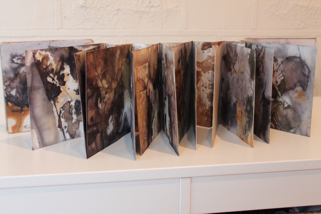
Meantime, may I show you some pics of some of my 2013 Artist Books in their clamshell cases, the latter made by my husband, Shlomo? We are both members of the Canadian Book Binders and Book Artists Guild. Our chapter, the Ottawa Valley, has an exhibit of members' Artist Books at the University of Ottawa Morriset Library for a month, starting January 13. The photos of the books were taken in last summer:

Rust and maple prints:

Now this is not an Artist Book, nor do I have his permission to show the work since the unnamed artist died several centuries ago. But the image shows inspiration for my Italian eco prints and eco dyes: Umbrian frescos, decayed over time.

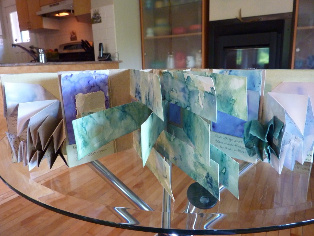
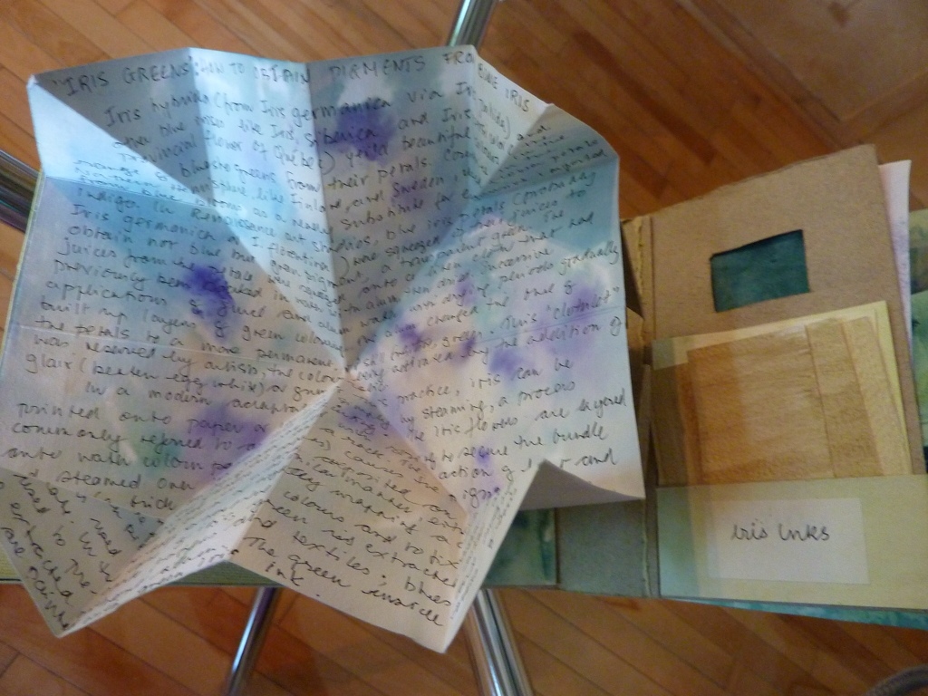
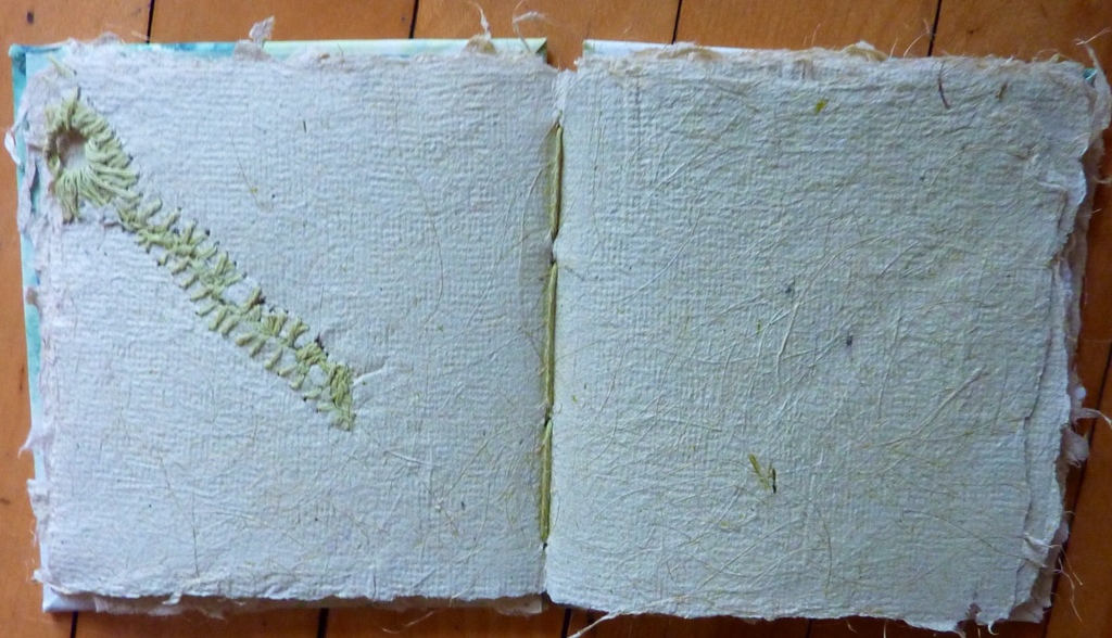
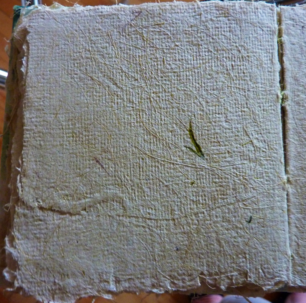
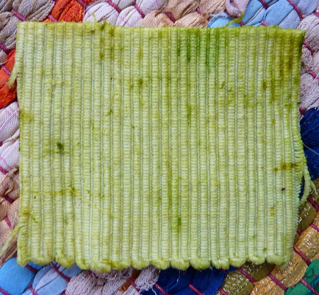
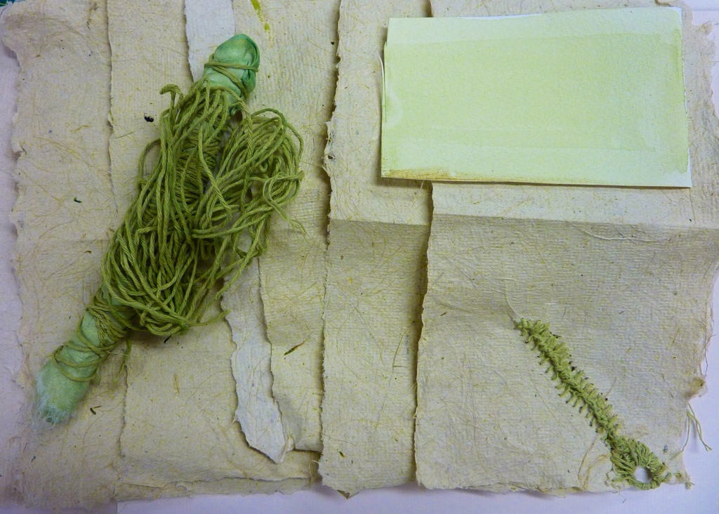
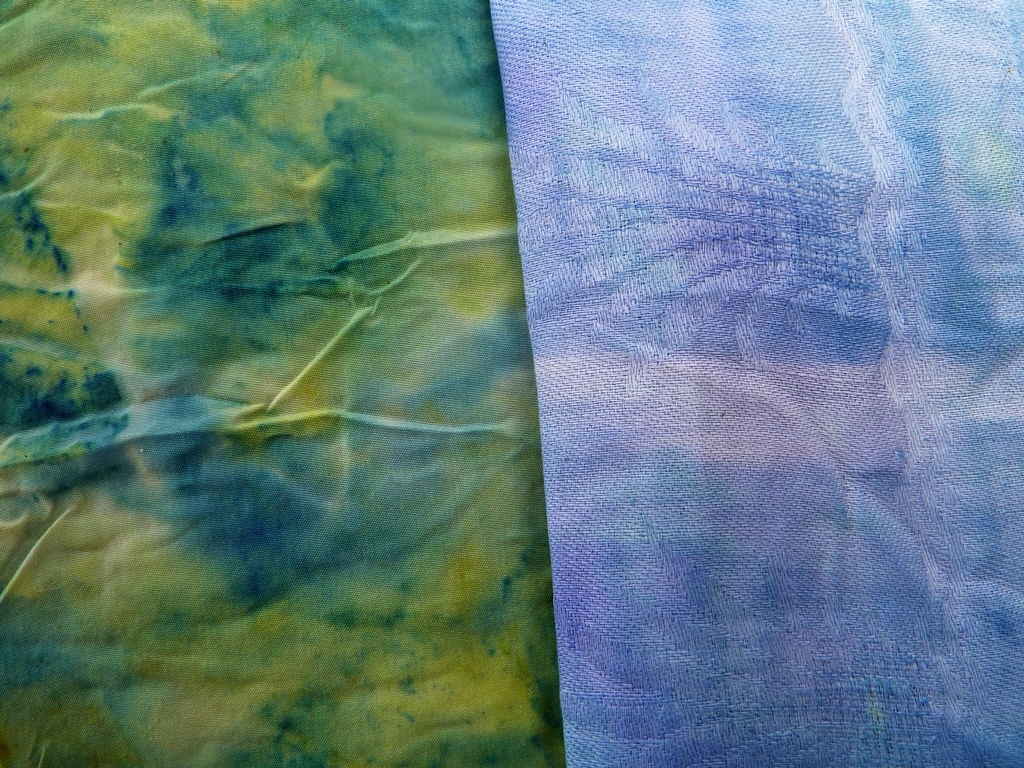
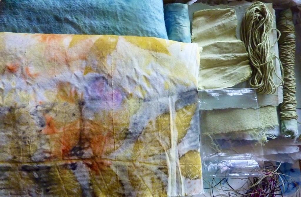
Below is a collection of contact prints on paper and textiles made with blue iris, part of my summer 2013 project to discover the pigment potential in blue iris blooms and the handmade paper potential of iris leaves. These works were exhibited at Portage du Fort, Quebec, as exemplars of Renaissance artist pigments and part of the Samuel de Champlain explorer festival. The display at Portage du Fort was later set up at the Ottawa School of Art. The photo shows a printed silk panel, several iris prints on paper and Artist Books of various structures including pages made with iris leaf paper, printed with iris pigment and iris ink. Clamshell case by Shlomo, papers by Wendy:

,

My artist residency work in Assisi:

More of my paper and textile fresco work, this time at the public gallery of the City of Assisi in the historic Piazza Commune. The photo shows a group exhibit of work by artists in residence 2013 at Arte Studio Ginestrelle, Assisi, Umbria:

One of my Artist Books shown at the University of Ottawa this month:

And the next series of beautiful glass mosaics was made by my daughter, Sarah, using a box of leftover glass fragments given to her by Shlomo. She took a pair of glass doors in her house and fitted the panes with glass mosaic:

Here is a work by another of my fave artists, my grandson, Dylan, now aged 4.

And a final work by an unknown artist's hand, found at the flea market in Gubbio where Saint Francis tamed the wolf: showing Assisi work, though in a less popular colour, pink. Note the beautiful damask linen weave typical of linen handtowels in that region. It is wonderful to think that once, time spent on work like this was considered time well spent:

Until the next Look Forward!

Happy new year to all my readers and a special thank you to all who have subscribed as followers.

Wendy


“Iris Green” pigment


The “iris green” of the Renaissance palette would have captured these shades of green in the landscape overlooking the Ottawa River at Portage-du-Fort, an area on the early 1600's exploration routes of Samuel de Champlain. The Stone School Gallery of the Pontiac School of the Arts marks the 400th anniversary of de Champlain's voyages in the region with a workshop in making and using Renaissance pigments and an exhibit of work by students and instructors.


My contribution post-workshop was a small selection of iris prints on paper and textile together with an Artist Book that documents the making of iris green pigment and the processes for obtaining contact dye prints with plants, in this case, the Tall Bearded Blue Iris. Renaissance artists would likely have had access to Iris pallida and Iris germanica, ancestors of the iris introduced to North America by early settlers and now a heritage variety in the gardens of Eastern Canada. This plant with striking blue flowers gave artists green for their palettes. The wild Iris versicolor (perhaps an escapee from pioneer gardens) is now the provincial flower of Quebec whose flag bears the image of the Fleur de Lys – a lily in name, an iris by form!


With these ideas in mind, and artistic license in action, the covers of my Artist Book show a green Fleur de Lys; the accordion spine (Saint Armand, Montreal “Canal” paper) is painted green with iris ink


The book is, of course, a Flag Book, punning on several levels: Irises are sometimes referred to as “flags”: the Fleur de Lys ( or iris flower when not a lily) is the name of the Quebc flag (technically the “fleurelise” – accents required) The symbol would have been known to de Champlain and possibly used by him, too.
The “flags” in the book are printed green with iris blooms, the green emerging when the paper is soaked first in alum. The image below shows fold-out pages in the Turkish mapfold structure; these are the pages that contain my text about the processes used to obtain the iris pigments. Two pocket pages complete the book structure- the pockets hold swatches of colours obtained from the iris petals to make ink and dye.


Here are examples of fold-out text pages and pocket pages:


The green clothlet (R) soaked in iris pigment: blue iris pigment turns to green in the presence of alum in the cloth. The blue-purple pigment in iris is an anthocyanin identified as delphinidin or delphinin. The blues and purples (L) are on paper that has not been treated with alum. The yellows come from the anthers of the iris blooms as well as being components of the pigments that separate out into analagous colours in the steaming process.


Then overall book structure:


The Clamshell Case made by Shlomo with my eco printed and dyed papers (book inside)


The open Clamshell:


Three Iris prints:


The Iris Scroll (vintage silk, eco dye-printed and hand embroidered: iris-dyed strings). Another little pun: Hanging the textile perpendicular the wall installs it as if it were a flag:


This close-up invites you to find the Fleur de Lys on the “flag”:


The Iris book:


One of the other artists, Rob HInchley, led students in watercolour painting sessions by the river. Rob is a highly accomplished and adventurous printer, also. For this exhibit, he also shows HUGE prints made from his woodcuts on plywood sheets and printed with ink by a STEAMROLLER!!!


Rob carved whispering pines in the plywood. He read that de Champlain had written about the pines in his journals…small wonder. In those days, the 100 foot trees of the old forests would have been an unforgettable sight.

Rob's woodcut prints by steamroller:


The carved plate:


Pretty awesome art by Rob.


The marks made by the wood cuts really do convey the soft whispers of wind in pine branches…you can almost smell the pine wood and resin…striking effects in a hard medium and huge scale.


A la prochaine!


Wendy


The Champlain Palette: Workshop in Renaissance Pigments

Follow this link to Genevieve's instructions on how to prepare Renaissance pigments:


A two-day workshop in recreating the palette of Renaissance painters at the time of Samuel de Champlain, an early explorer and map maker of Eastern Canada, was offered this weekend at the Pontiac School of the Arts in the charming riverside village of Portage-du-Fort, about 100 kilomètres from Ottawa, west along the mighty Ottawa river. Genevieve Samson, book conservator at Library and Archives Canada and specialist in pigments in medieval and Renaissance MSS and books, led the workshop, assisted by local artist Rob HInchley. Her goals for the first day were to instruct participants in the composition and making of 33 organic and inorganic pigments and on the second day, for participants to use a smaller collection of thirteen pigments under Rob's tutelage to paint watercolours of nearby riverscapes where Champlain would have travelled. What a perfect set of interesting and achievable goals! And after this the students would have a show of their work at the art school.
 
Along the road to the school, July wildflowers abound: Hypericum perforatum, white daisies, blue Bear's Breeches, pink wild dianthus, white Achillea, early Golden Rod and Queen Anne's Lace. Here, going down to the Ottawa river are blue and white blooms appropriately coloured blue and white for Quebec:


The Renaissance Palette and the use of powdered pigments
 
Using a huge array of powdered pigments originating from all over the world and obtained through Kremer in New York , KAMA in Montreal and some made by Genevieve herself, the class created thirty-three samples of paints in yellows, reds, blues, browns, greens and oranges. We used gum arabic as a binder to make watercolour paints from the pigments; we also learned how to make egg tempera paint with egg yolk and pigment. No tap water but demineralised water should be used to make the paints when water is required.
Genevieve has made efforts to obtain the pigment powders from their places of origin. It was not always possible for sometimes the supplier did not want to reveal sources…In the future she hopes to make her pigments starting from scratch using the soil, the rocks, the plants, etc. But she cautions that steps must be taken to ensure that pigments made directly, e.g., from clay, must be made free of impurities that can cause mold growth, etc.
After each paint sample was mixed and made ready, we entered the colours in the chart:


We learned that painters of the day did not blend colours together but used them pure.
 
For each student to take home, Genevieve had prepared in advance a set of thirteen pigments of the above colours in small pans in a watercolour tray:
 
 
As part of her presentation on pigments derived from plants, Genevieve asked me to share the results of my iris clothlet experiments previously reported here
 
Painters carried their pigments in white shells like these below because the colour of the shells enhanced pigments so that they “read” correctly. Genevieve showed images in medieval paintings of painters using shells for their pigments.
 
The top row of shells contains alum and iris pigmented linen clothlets soaked in Gum Arabic (L) and glair AKA egg white (R), with resulting colour; the shells on the bottom row contain clothlets without alum.


Tips, Tricks and Gossip a la Renaissance Pigment class
 
Genevieve is a warm raconteuse and tells flavourful side stories to keep us working while we mix and grind our pigments. Some examples to share:
 
– Renaissance painters and dyers were often a cagey lot. We have lost a lot of useful knowledge because of this tendency to keep trade secrets but at least it keeps conservators employed… Trade secrecy is maybe an issue sometimes today, too…
 
– One “secret recipe” for a dye process contained nasty inclusions like rancid fish oil…We wondered if this ingredient was early “disinformation” in action: the release of sketchy info in the hopes that a competitor would steal the process and suffer loss of business as a result…We speculated suspiciously that we know people can give out their pie recipes but with something missing or a false ingredient, etc…Was that Renaissance dye recipe “leak” like a modern day Wiki-leak? Controversial topics then as now…

– As recently as the 1980's in France, women conservators at the National Library were permitted to carry out only the first steps in restoring bindings. They had to pass the final finishing work to male binders and were not allowed to know how to do the males' work…
 
— A tip for preserving pigment “cakes”: Do not keep them in ziploc baggies where they get no air. Either vacuum seal the bag or store the pigment cake in a container that lets in some air.Here is some paint that grew mold in a ziploc bag. Gum arabic can go bad, too.
 
 
– Tips for making egg tempera paint: Use older rather than fresh eggs; the egg yolk is good for one day only – mix pigment with a new yolk the next day.
 
Sharing Knowledge
 
Genevieve gave permission to describe freely the content of the class and to publish photos, as did the other students. She said she would like nothing more than to spread the word about the beauty of these pigments and the fascinating processes involved in making them. As a researcher, she is committed to spreading current or new knowledge as well as restoring lost knowledge.
 
The link below will take you to a slide show on the How To's of Renaissance pigments a la Genevieve Samson:

Genevieve's email address:
 
gensamson27@gmail.com
 
End Note
 
The Fleur de Lys (“Lily Flower”) forms part of the Quebec provincial flag and is a design long associated with French history and culture in France and in Quebec. It was used in France at the time of Champlain. Its origins as a symbol go far back to the sixth century when King Clovis of the Franks adopted it in his banner. Did he intend to call this flower a lily, which is the strict meaning of the term? The symbol is pretty obviously not a lily at all but an iris. Perhaps he, as a native speaker of a Germanic language and not French, as a soldier and a conqueror, would not have worried too much about correct French plant identification. What did it matter, lily or iris? I think what most likely mattered was that this flower shows a tripartite separation of petals and in religious imagery, could have been a apt symbol of the Holy Trinity for King Clovis, a new convert to Christianity.
 
The adorable little lapel buttons below have clever designs within the Fleur de Lys form, demonstrating aspects of Quebec French culture:


Next post: What's new in the garden for eco dyes? And yet another stage in the Iris Camino.


Iris Scrolls: Artist Books printed with iris pigments

My “Iris Camino” continues.

Today on my Iris Journey, I introduce two companions: Artist Books, printed with iris dyes and one of them made with pages of iris leaf fibre. (For pics of the Tall Bearded Iris, check iris eco print tags).


“Iris Scroll 1”, the first book is (re)made from thrifted and repurposed blank journal pages, paper type unknown but perhaps some kind of hand-made mulberry paper (The waffle weave typical of J cloth-type cloths used for drying papers is obvious on the journal page surfaces).


The book pages were singles so a “Flag Book” binding came to mind. And since a pun is involved (“Flag Iris” is a kind of wild iris growing near water), I enjoyed the connection to my chosen book structure.


Below is how the pages looked after being inserted into an accordion-type spine made of another found paper, no idea what kind of paper but it was too soft and fabric-like and a b**** to work with here.


I made a separate hard cover to house the Flag Book; the spine on the hard cover is made of my iris leaf fibre paper:


The single pages fly like flags:


The dye prints on the book pages ( “Flags”) were obtained from the bounty of the early June garden: Iris (blues, purples, turquoises and greens); Rhus typhina (sumac leaves: greeny-yellows and khaki-type browns); Coreopsis verticillata (reds, oranges) and spent Tagetes blooms (greens and browns from the calices; yellowy-orange from petals). The cover image is of a sumac leaf touched by iris and coreopsis; the spine is made of iris leaf paper, in two layers:


For the book spine (iris fibre paper) I used the thicker sheets, and coloured the inner spine paper with green iris ink:


Three overlapping “Flags”:


“The Medium Is The Message” (Marshall MacLuhan) in this next book.


” Iris Scroll 2″ has a coptic binding structure with covers and endpapers made from iris-printed watercolour paper, pages made of iris leaf fibre and sewing string dyed green with iris ink:


Oy. The iris paper is extremely fragile even after having added newsprint pulp (will use abaca or kozo next time) so the stitching turned out to be true “Stitch and Bitch” sessions…But still fun, ha ha, as bitchin' can be…
 
 
To sew, I used cheap cotton string dyed in iris ink, even though that string was really too thick for delicate stitching…The page papers ripped when I put in the needle and string, the pages failing to match up perfectly with the cover holes. I went back and reinforced the signatures with linen tape dyed in iris ink. That worked up to a point but did not hide the holes completely. Ironing the paper did the trick in closing most of the unwanted holes.
 
One must, at times, make a virtue out of necessity. I enjoy the “ghetto” effects of the rough papers, the very hairy deckled edges, holes everywhere all stitched up, the chunky pale green string…A study in contrasts with the elegant Iris prints in a range of blues and greens on the covers. I enjoy the abstract impressions made by the iris blooms that allude to original forms without replicating them.


” Surface Textural Interest” – AKA, Curator Art Speak for little fragments of unblended iris leaf as well as mends in the paper attempted with pulp when the page ripped during my sloppy couching:


More “textural interest”: AKA, blobs of white newsprint that I did not blend well with the iris leaf

fibre:


Wonky alignment of holes due to ripped paper in the signature folds:


Overall, though, I love the imperfections.


Next post: Renaissance pigments and the class with Genevieve Samson, book conservator and Renaissance pigment expert at Library and Archives Canada in the nation's capital, Ottawa

O, it was lovely! And perfect.


Iris leaves as a source of paper and pigment

First, some pics of my Artist Book “Botanica: New World Scroll” referred to in my previouscpost. The tutorial I published here some minutes ago gives instructions for making a book like this. The July issue of Somerset Studio magazine has published my article on how to make this book. That is great! But Because of some editorial errors and wishing to correct the info for readers, I have published my unedited article here for readers' benefit – as well as to relieve my own anxiety. See previous post!

This book will be in the show of work by the Canadian Book Artists and Bookbinders Guild held in Calgary later in July at the University of Calgary. And speaking of Calgary prayers and hugs go to my blog buddy arlee barr of Calgary who lost so much especially her studio.

Now a return to the Iris Adventure, El Camino de Las Irises ( forgive the rusty Spanish).

Guessing that blooms were not the only source of colour in iris, I decided to cook up some iris leaves to see if I could obtain both paper and pigment.


In water to cover and a cup of soda ash, the cut-up iris leaves (post-bloom period) were soaked overnight, then simmered at 180 for three hours in a large granite canning vessel.

Into pot also went a few lengths of alum-mordanted habotai, a bit of cotton, some vintage linen. Plants and fabric were simmered an hour together and left overnight.


The familiar soft iris green developed on the fabric in the pot but turned a neutral “greenge” when dry. Time to get out the dye assistants. Copper sulphate (home made, vinegar on copper pipe) can shift colours towards greens. Indeed it did, but much more strongly on silk (R) than on linen (L).


Iris leaf sludge made this ribbed cotton quite green. The sludge is a kind of green paste that settled in the bottom of the dye pot and that I collected after draining the pot:
 
After dyeing the fabric in the pot with iris leaves, I set about making paper from the leaf fibres. I was pretty sure by then that any paper made from iris leaves would be green.
I have made paper in a class situation before but never from my own garden plants. My aim was to produce handmade iris leaf paper to use in an Artist Book about irises and pigments.
Here is the first sheet, handpulled and a soft green (but not such good colour in the photo). Husband made me a mold and deckle from scrap wood and window screen fabric, 4″ x 8″, a good size for pages in a small book. I followed the usual papermaking steps: cooking the plants, straining them, rinsing the fibres well, squeezing out as much water as possible, separating the fibres into wee bundles, processing handfuls of plant fibres in a blender, mixing the iris fibre with newsprint (unprinted) pulp in the vat, pulling the pulp up on the mold to make a sheet, couching the sheets in a stack, pressing and drying the sheets.


I made 17 – 4″ x 8″ sheets from my pot of iris leaves, some thicker than others. The thicker, the greener.

The thinner, the more easily frayed or fragmented and in need of some fun stitching. (Repairs to medieval vellum MSS were often done with lovely embroidery. Very entertaining to the eye)

The thread I used for reparing the breach in the paper was cheap cotton string, solar dyed in green iris ink made from blue blooms. Waxing with beeswax made the cheapo cotton very much easier to work with. I was trying to work with comes to hand, like cheap string.

Don't forget that you can see a close up by clicking on the photo- you can even entertain your Inner Stitch Police Persona by checking my hand sewing…Note the various greens possible, depending on the material dyed:

Below, you see the different textures imprinted on the papers as they dried on J Cloths and Shop Towels; plus you can see the long iris fibres. Some of the papers have bits of green leaf embedded. Poor colour reproduction here, though – they hardly look green at all! They sorta look like home made crackers.

I do enjoy the deckled edges!

Next time: The Iris Book: with iris flower eco prints and iris leaf papers. This turned out to be serious Eye Candy for me!

After July 6, reports on soil pigments plus comments on my class on Renaissance pigments and using the iris “clothlet” as a source of green pigment for painting.

NB I am still looking for confirmation on the correct name for the iris variety that produced iris green for Renaissance painters and before them, Medieval MSS artists. I have out out requests…

Meantime, a few pics of fun things from my June garden, before June departs:

Perennial Geranium eco print on watercolour paper, dipped in iron liquor:

Ditto, a sumac leaf print:

Used iris blooms composted on watercolour paper:

Coreopsis, iris blue, iris green solar- dyed string:


Happy Canada Day July 1 and Happy Fourth Of July this week to all!


Wendy


Iris Eco Dyes and Prints

This is Part Two of my “Iris Post”. FYI, when I explore a new (to me) plant for dye potential, I sometimes enjoy a little play at Kinder Chemistry. Three jars are set up for solar soaking: Jar 1: water; Jar 2, water with alum; Jar 3: water with ammonia. Into each goes the plant material and the resulting colours are; purple (water plus iris, no alum): turquoise green-blue (water and alum plus iris) greenish (later, yellow): water and ammonia, plus iris. (The jar of red in the pic is corepsis, for another post)

Below: El Camino de los irises:

Iris on alum mordanted vintage silk. The greenest parts are from the calices; the yellows from the “beards” or pollen bearing parts.

Close up:

The same on an 80% wool-20% silk mix:

Close up: Now this is green!

The alum mordanted silk, steamed, on the left. Iris juice finger-smooshed onto vintage linen, no heat, on the right. (Your fingers go seriously blue)

Below: Smooshed iris on mordanted linen (L) No heat.

Smooshed iris on unmordanted linen (R). No heat.

Below:Pounding, grinding, squeezing, treading the blossoms: with and without heat processes.

Iris juice dripping from the vase of blooms. You can squeeze the juice out, too. Even the spent blooms give colour, as does the spent plant material, post printing. This bloom contains a lot of pigment. I spread fresh and spent and juiced blooms onto my linen panel for hapazome. The blue drop below stained my fifty year old varnished oak table! Blue, too.

Pounding with a rock: damp linen, unmordanted. The colours separate – that happen mostly from various colours coming from the different plant parts. Colour also comes from various dye component chemicals in the blossoms that separate out in the process.

Below: With coreopsis (red-orange) on found paper, Iris sibirica, pounded on after other plant colours were steamed on; mordanted with alum.

Lower left: sumac and coreopsis with iris on mordanted silk, a tad of rusty iron. Note the purples.

Upper right, cotton string in an iris dye bath, mordanted: paper, ditto (moss greens)

Iris sibirica on linen, treaded in (that is my left foot, lower left.) Yellows from the anthers and stamens.

Unmordanted, steamed papers (left). All blues and mauves. Mordanted, steamed papers on the right. A range of medieval greens.

Next time: the third iris post – about the “hapazome” ( pounded, treaded) length of linen and the frozen blooms. We are away for five days and the iris will be gone gone by then, no stagglers. So whatever is left of the June 2013 crop will go into the freezer. More printing a dyeing on top some artist books to finish

It has been lovely working with the iris

Wendy


Iris Eco Dyes

The tall Bearded Iris are almost done, a short two weeks or so of bloom. Iris sibirica ( or siberica) likewise. You have to move fast to eco print or dye with them fresh or faded; alternatively, you can freeze them. I have done both and that's what I would like to share with you mad eco dyers out there – it will take a couple of posts. To start with: Iris hybrida, which is a heritage variety in Eastern Canada, probably imported by early settlers and still plentiful in gardens here. Iris do hybridize freely and most likely descend from ancient varietiies such as Iris pallida and Iris germanica, of which florentina is a cultivar. The latter two, I. germanica and I. florentina are most likely the irises available to medieval and Renaissance painters and manuscript illuminators. These artists used their iris to obtain not blue but green pigments. Art historians and popular art history writers have been a tad vague about exactly which varieties were used, so one has to dig…but cheap and available is what artists usually go for…”The Techniques and Materials of Medieval Painting” by Daniel V. Thompson (Dover Books) tells rather vaguely of how green was obtained from iris but is even vaguer about blue or purple. Thus experiments have to be the way forward for contemporary eco dyers.

..and cutting to the chase: this is the range of colours obtained from the Tall Bearded Iris, above. The colours are shown on papers and on cotton string. Greens are obtained when the substrate, paper or fabric, has been pre soaked in alum (alum acetate is what I used) then steamed as usual for eco prints. Blues are obtained when NO alum is used in the steamed bundle or stack. Purple and bluer- blues are obtained from pounding with a rock etc, treading (yes, treading), grinding in a mortar, or simply smooshing hard with the fingers – NO cooking, just resting for a period of time. BTW, the string was dyed in a crock pot with alum and blossoms. The photo colour is far from true. I obtained a lovely moss green on the cotton string

The medieval painters and illuminators thought that iris green was fugitive and welcomed later sources of green as more reliable. They obtained it by squeezing the juice from the iris blossoms onto a piece of dry alum-soaked cloth, presumably linen, letting the pigmented cloth dry, then repeating the process until the green colour built up. The “clothlet” was transported in a seashell, for example, and egg white (“glair”) was added for the iris pigment to leach into. This was the source of a transparent green.
More next time on how the iris pigment behaved on silk, wool, linen and cotton rag paper, after I used all of the previously mentioned processes with and without alum as mordant. If you are inclined to try dyeing with iris ( do we need to say “eco dye” ?) then pick the faded blooms and either go to work right away or freeze them for later.
El Camino de los irises: it has been a pilgrimage indeed, working with them. Here they are laid out on vintage kimono silk, ready for the steamer:
More on iris next time.