Snow Comes To The Kaleyard

Winter means art indoors and the studio is my refuge. For natural dyeing and eco printing, I use my stash of dried plants, dye powders and whatever fresh plant materials I can find in the fridge or a florist bouquet. The first snow in the kaleyard this year sent me scuttling about to bring in one of my Potted Plant Pets that, forgetful gardener that I am, I had neglected all summer and fall. Out of sight, out of mind: it was hidden, pot and all, by the huge foliage of that Monster Kale. Si when the vernight temperature fell to about two degrees, that was curtains for the leaves on the indigo (Indigofera tinctoria).

I had started the seeds indoors in March and set out the largest plant In a pot after the last frost in late May.The indigo looked like this (below) in June beside the Kale Monster; by November, it was hidden completely by the dinosaur kale.

Let us see if the now-leafless indigo pet will revive. More below on this indigo and its gifts to the dyer.

Meantime, I did manage to bring in the Japanese indigo (Persicaria tinctoria) and pot it up for overwintering. This type of indigo also yields blue pigment so I have dried several batches of leaves to try winter vat-making. In the past, I have found that the plants will set seed in their pots and produce seedlings in late winter. But for good measure I have saved seeds this year. One of my dyer friends here in Ottawa says she even finds seedlings in her compost in spring! That is a plant with a huge will to survive, even if with a reputation for short seed viability.

Here are the leaves of Japanese indigo, dried after the first of three harvests this year:


And here are some dye results on silk velvet, post-dyeing and pre-eco printing ( Those little brown pebbley things that look like critter poo are, in fact, dried tansy buttons.)

The blues I obtained (above) from my first-ever Japanese indigo vat are, as you can see, on the turquoise side of blue.

Later in the year ( when I am back from January in Brooklyn where our youngest is about to have her first baby) I will have a go with a vat using dried the Persicaria tinctoria but likely not before February.

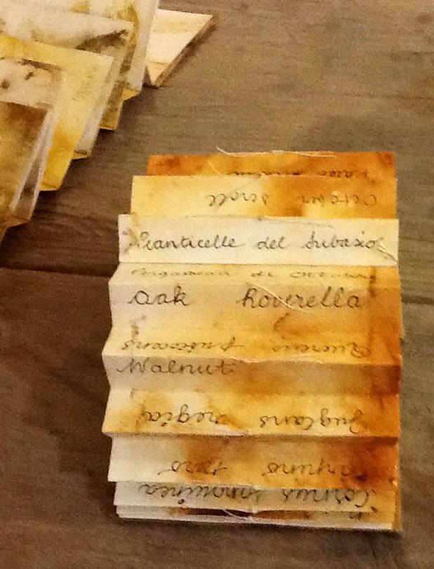
On to dyeing with other indigo now – the Indigofera tinctorIa. I am chiefly interested in using this indigo for my Artist Books. My current focus is, as you might know by now, Artist Books made with and about native plants, the Medium being the Message in my approach to the work.

But I am not so granola that I shun non-native plants like European kale, Japanese indigo and indigo (probably) from India. We are all strangers and sojourners on this earth, are we not? And we likely come from somewhere else, and will end up somewhere else again, more than likely. I am from Orkney, as it happens, but live now in Ottawa, Canada, via Liverpool in England. Green Immigrants have a valued place in my garden; potted, they are Plant Pets; they will always find a place in my repertoire as a dye artist even if native plants are my garden focus. We have transplantation, translation and removal in common, and the search for where to put down roots, scatter seeds and lay one's head.

Indigo paper has an interesting history in the book and paper arts, too. ( A discourse on that topic will follow at another time, dear Reader! ) Indigo papers will be a fine little Rabbit Hole for me to disappear down with my pre-reduced indigo, taking along rust and black tea leaves as companions, plus some others (like beeswax) to sustain and surprise us on the journey.

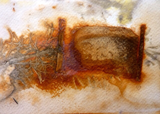
Feeling connections to the traditional use of indigo for colouring papers of various qualities and types, especially for the express purpose of hiding imperfections, I have begun to accumulate indigo-and-rust dyed materials to create a series of Artist Books, with tea leaves for tannins to blacken the rust. And some beeswax to trap the rust, like insects in amber. And dye and wax to cover over many things, like the mold on paper left too long soaking in alum water…And, O that divine blue and orange combo, the Impressionist painter's expressive colour gift to humanity and art history.

To get the blue markings, I dipped, painted, sprinkled, splashed the dye and scattered crystal before eco printing it with the rust and tea on watercolour paper. I dissolved pre- reduced indigo crystals in water (no chemicals added) and also scattered crystals on the pages to be eco printed as usual by steaming. To get the rust, I laid on flat bits of metals and soaked the metals and the paper in white vinegar befor steaming. (You can skip the steaming step if you are OK waiting a day or so for the rust to print. The hot steam simply accelerates the process. And the indigo needs no steaming, either. But if you want tannins to react with the rust, and you'd like marks from the tea leaves, then steam the stack or bundle as I did with tea leaves scattered on) Some examples:

Here is a batch of indigo, rust and tea prints on paper:


The dark marks in this one are from molds on composted papers:


And here is some linen printed with indigo, rust and tea: this will become book cloth.


This (below) is what happens when you scatter the indigo crystals on top of paper and plants for eco printing; logwood and madder powders are scattered in there, too, on top of mold marks and rust. I showed my friend, Gayle, how to do this and this was her result at my studio:


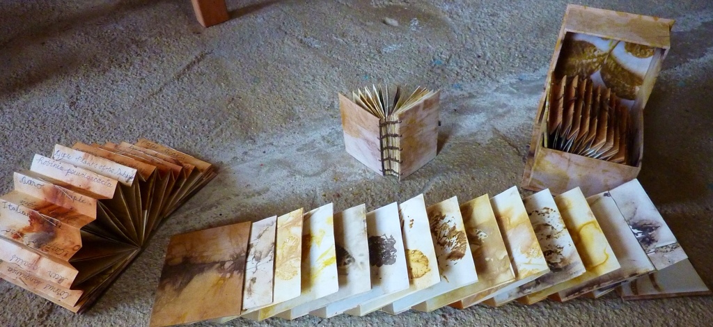
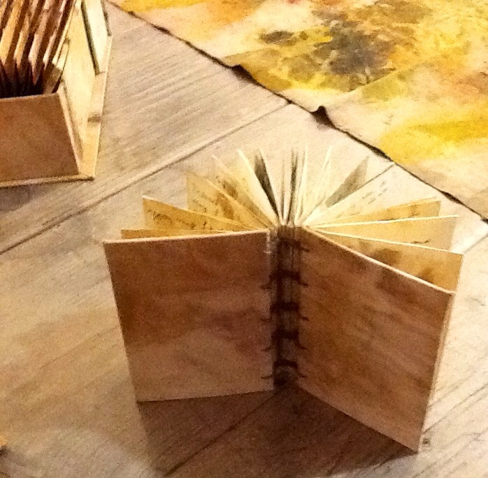
Finally for this post: some Artist Books, including work from a bookbinding workshop offered by the generous Genevieve Samson, medieval book conservator at Archives Canada and CBBAG member. Longstitch binding: the white one is mine, the next two are Gen's demo books, the coptic binding is by Gayle Quick of CBBAG and the blue and white on the bottom of the stack is a canvas wrapper I painted with acrylics.


Next time: more books, more indigo and some painted chair covers


Blessings on your day, dear Reader. Thank you and welcome to all the new folks who have joined the blog since last post.


Wendy


More October Ecoprints from the Subasio

“Inspired by the broken colours and forms of the still-radiant ancient frescos on the walls of churches and streets in Assisi and neighbouring medieval hill-towns, I created a series of Artist Books and textile frescos whose content refers to the natural environment of the Subasio as well as to its powerful spiritual and Dantean heritage. My intention was to research the bioregional plants of the Subasio near the Arte Studionestrelle at Santa Maria di Lignano and to discover natural pigments which I could use to dye and print locally-made paper and vintage linen. I was interested in a contemporary application of the traditional knowledge about natural dyes associated historically with this region of Italy where much of that older wisdom seems to have disappeared. My question was: Could some version of that knowledge be restored? The October native vegetation growing high up the mountain provided a rich palette from leaves, bark, berries and late blooms that worked together in successive layers of dye and print. My work on this beautiful mountain recalls to me the Fioretti (Little Flowers) of Saint Francis of Assisi whose love for the Umbrian landscape brought him and others closer to God. And although I was here too late in the season to use the traditional ginestrelle blooms in my prints, I was able to obtain much colour from their seed pods! ” (Shlomo Feldberg constructed covers and boxes for Wendy's Artist Books during his residency in addition to completing his own mixed media work.)

The statement above about my work during my residency at Arte Studio Ginestrelle appears in the catalogue for the show of contemporary art at the public art gallery of Assisi. The show takes place the last week of November. As well as the inspiration I found so abundantly in and around Mount Subasio, I am pleased to share with you some of the Artist Books and textiles created during my October 2013 residency and featured in the annual exhibit by many of the Artists In Residence. I have also brought home with me many eco printed papers and textiles that will form much of my work later in the winter.

First pic: Umbrian handwoven linen, highly textured and serviceable cloth; an Assisi-fleamarket find, vintage but never used.

It took me many prep and printing sessions with mordants and local plants to express the Giotto/Cimabue/Pintoricchio fresco colours I had in mind. Even then, I used madder dye powder for the reds since Rubia tinctorum does not grow at almost 1000 metres above sea level where the Studio is located.

The abundance of yellows in the earlyOctober leaves was a challenge. During my first week of printings, shades of yellow or brown was all I could manage to obtain using a basic alum acetate mordant. Hmm. I knew I would print the papers and cloth several times again for more colour and form.

As the October days passed, the fall colours began to change and pigments both increased and decreased in the leaves. I searched for sources of blue and found them in Dogwood berries (Cornus sanguinea), Sloes (Prunus espinosa – tiny plums) and Cotinus coggygria (more blue after the middle of October). Purple showed in the bark of walnut twigs (Juglans regia) as well as late blackberries (Rubus fruticosus) and sloes; greens from Dogwood leaves (and berries, too); moss greens from Rosa canina (Dog Rose). The yellows were varied: Golden-apricot from Olive leaves; deep golden from Walnut; yellow-chartreuse from Sumac. The “ginestrelle” or Dyer's Broom (Cytisus scoparius in these parts) had only seed pods for printing tannin browns in October, its brilliant yellow blooms long gone.

Here, blue, green and teal from Dogwood berries and leaves:


And the enticing golden yellows from European Walnut on old cotton sheets:


A small display of yellows with iron (flowers by Shlomo)


Dogwood greens, walnut yellows and deep browns; pinks and purple-pink from walnut twig bark.


Rusted silk chiffon with BlackBerry and Dogwood berries:


Dogwood and walnut with the last sunflower:
 
 
Walnut with Dogwood, Elder and iron:


Artist Books : “Subasio Scrolls”

With the Subasio Scroll Collection I am continuing to develop an earlier goal: to use the accordion book form as a botanical scroll. This collection of three books is entilted “Little Plants of the Subasio: October Scroll” (1, 2, 3). A fourth book is coptic-bound and contains my handwritten copies of sayings from Dante and Francis of Assisi. The book is also entitled “Little Plants of the Subasio”.

Each page of each book, back and front, is printed with leaves, bark and/or berries and fruits of the area around Arte Studio Ginestrelle, which is llocated nearly at the top of this part of the Subasio. The range of available plants changes with the altitude (here, between 800 and 1000m.) So while madder might be found on the bottom layer of the vegetation belt, only a relative (Galium lucidum, but not a red one! ) was found at the mid-to-high level where the Studio is.


My aim was to use only what I could forage within that vegetation layer on the mountain and therefore not to import plants from other areas. I did succeed in that aim, except for my use of powdered madder…one cannot express the spirit of Giotto's frescos without red! All the other plant colours came from the vegetation right at hand.

(Aside: I was unable to find any really good locally-made paper for my books , despite the fact that the Fabriano art paper factory is within a few hours drive of Assisi and the other hill towns. The art supply shop in Florence was closed on Saturdays, the day we went there. One bookbinder we met in Florence says he sends for his supplies to Talas in Brooklyn!!! Or to Paris or Germany. Wow. )


Some of my main pigment sources were: Juglans regia, Cornus sanguinea, Rubus fruticosus, Prunus espinosa, Robinia pseudoacacia (invasive, introduced), Carpino nero, Quercus robur, “Rutacae” – species unknown except for the family relationship), Sambucus negra, Rosa canina, Acer opalus, plus Olive and Grape.


My “Subasio October Scrolls” collection of Artist Books consists so far of three accordion-spined and one coptic-bound book. ( Covers and Book Box were made by Shlomo Feldberg using my printed textiles and papers.) These Artist Books remain in Assisi for exhibition. Others will be added to the collection in time as I continue to work with the many papers and textiles I made there and brought home.


Below: Walnut leaf print on the box: walnut dyed linen thread for the book stitiching


Completed scrolls atop the reference books I used to help me identify the native and local plants. I had hope they could tell me which might be for use as sources of pigment. None of these books discussed the traditional dye uses of the plants, even when they gave extensive info about medicinal use. This confirmed my supposition that natural dye knowledge about the area was limited or non-existent.


A wild fennel and rust page in one of my books:


Walnut leaf page:


An arrray of pages in a scroll book:


The spine of a book with plant labels in English, Latin and Italian:


Robinia pseudoacacia:


Carpino nero (Black Hornbeam):


The little coptic-bound book of sayings from Dante and Francis of Assisi; on ecoprinted pages:


Dante, Canto IX. Mount Subasio and some prayer-poems by Francis of Assisi.

 
Title page:


Book box and book covers:


I leave you today with a promise to post more pics and info when (a) I have sorted and retrieved some lost photos (FB crashed iPhoto and ate my camera upload…lost a LOT of pics!!!) and (b) after we have moved to our new house next week.

(This is not our new house)

Those colours! The ducal palace at Gubbio, the town where Francis tamed the wolf:


Here is more inspiration from tne colours and forms of Umbria:

The view from our bedroom:


Look up for inspiration:


Look down…


Even the distressed surfaces inspire: in fact, these above all…


I hope I leave you looking for more like Brother Cat Cimabue (L) and Brother Cat Negrito (R)- the Studio's Resident Royalty, assigned to outdoor duties but skilled in finding “work” inside


More pics next time! Leaf prints for book pages, inspiration photos…and photos of the Studio and environs.

Best to you, dear Reader.


Subasio Scrolls and Fresco Textiles

“Inspired by the broken colours and forms of the still-radiant ancient frescos on the walls of churches and streets in Assisi and neighbouring medieval hill-towns, I created a series of Artist Books and textile frescos whose content refers to the natural environment of the Subasio as well as to its powerful spiritual and Dantean heritage. My intention was to research the bioregional plants of the Subasio near the Arte Studionestrelle at Santa Maria di Lignano and to discover natural pigments which I could use to dye and print locally-made paper and vintage linen. I was interested in a contemporary application of the traditional knowledge about natural dyes associated historically with this region of Italy where much of that older wisdom seems to have disappeared. My question was: Could some version of that knowledge be restored? The October native vegetation growing high up the mountain provided a rich palette from leaves, bark, berries and late blooms that worked together in successive layers of dye and print. My work on this beautiful mountain recalls to me the Fioretti (Little Flowers) of Saint Francis of Assisi whose love for the Umbrian landscape brought him and others closer to God. And although I was here too late in the season to use the traditional ginestrelle blooms in my prints, I was able to obtain much colour from their seed pods! ” (Shlomo Feldberg constructed covers and boxes for Wendy's Artist Books during his residency in addition to completing his own mixed media work.)

The statement above about my work during my residency at Arte Studio Ginestrelle appears in the catalogue for the show of contemporary art at the public art gallery of Assisi. The show takes place the last week of November. As well as the inspiration I found so abundantly in and around Mount Subasio, I am pleased to share with you some of the Artist Books and textiles created during my October 2013 residency and featured in the annual exhibit by many of the Artists In Residence. I have also brought home with me many eco printed papers and textiles that will form much of my work later in the winter.

First pic: Umbrian handwoven linen, highly textured and serviceable cloth; an Assisi-fleamarket find, vintage but never used.

It took me many prep and printing sessions with mordants and local plants to express the Giotto/Cimabue/Pintoricchio fresco colours I had in mind. Even then, I used madder dye powder for the reds since Rubia tinctorum does not grow at almost 1000 metres above sea level where the Studio is located.

The abundance of yellows in the earlyOctober leaves was a challenge. During my first week of printings, shades of yellow or brown was all I could manage to obtain using a basic alum acetate mordant. Hmm. I knew I would print the papers and cloth several times again for more colour and form.

As the October days passed, the fall colours began to change and pigments both increased and decreased in the leaves. I searched for sources of blue and found them in Dogwood berries (Cornus sanguinea), Sloes (Prunus espinosa – tiny plums) and Cotinus coggygria (more blue after the middle of October). Purple showed in the bark of walnut twigs (Juglans regia) as well as late blackberries (Rubus fruticosus) and sloes; greens from Dogwood leaves (and berries, too); moss greens from Rosa canina (Dog Rose). The yellows were varied: Golden-apricot from Olive leaves; deep golden from Walnut; yellow-chartreuse from Sumac. The “ginestrelle” or Dyer's Broom (Cytisus scoparius in these parts) had only seed pods for printing tannin browns in October, its brilliant yellow blooms long gone.

Here, blue, green and teal from Dogwood berries and leaves:


And the enticing golden yellows from European Walnut on old cotton sheets:


A small display of yellows with iron (flowers by Shlomo)


Dogwood greens, walnut yellows and deep browns; pinks and purple-pink from walnut twig bark.


Rusted silk chiffon with BlackBerry and Dogwood berries:


Dogwood and walnut with the last sunflower:
 
 
Walnut with Dogwood, Elder and iron:


Artist Books : “Subasio Scrolls”

With the Subasio Scroll Collection I am continuing to develop an earlier goal: to use the accordion book form as a botanical scroll. This collection of three books is entilted “Little Plants of the Subasio: October Scroll” (1, 2, 3). A fourth book is coptic-bound and contains my handwritten copies of sayings from Dante and Francis of Assisi. The book is also entitled “Little Plants of the Subasio”.

Each page of each book, back and front, is printed with leaves, bark and/or berries and fruits of the area around Arte Studio Ginestrelle, which is llocated nearly at the top of this part of the Subasio. The range of available plants changes with the altitude (here, between 800 and 1000m.) So while madder might be found on the bottom layer of the vegetation belt, only a relative (Galium lucidum, but not a red one! ) was found at the mid-to-high level where the Studio is.


My aim was to use only what I could forage within that vegetation layer on the mountain and therefore not to import plants from other areas. I did succeed in that aim, except for my use of powdered madder…one cannot express the spirit of Giotto's frescos without red! All the other plant colours came from the vegetation right at hand.

(Aside: I was unable to find any really good locally-made paper for my books , despite the fact that the Fabriano art paper factory is within a few hours drive of Assisi and the other hill towns. The art supply shop in Florence was closed on Saturdays, the day we went there. One bookbinder we met in Florence says he sends for his supplies to Talas in Brooklyn!!! Or to Paris or Germany. Wow. )


Some of my main pigment sources were: Juglans regia, Cornus sanguinea, Rubus fruticosus, Prunus espinosa, Robinia pseudoacacia (invasive, introduced), Carpino nero, Quercus robur, “Rutacae” – species unknown except for the family relationship), Sambucus negra, Rosa canina, Acer opalus, plus Olive and Grape.


My “Subasio October Scrolls” collection of Artist Books consists so far of three accordion-spined and one coptic-bound book. ( Covers and Book Box were made by Shlomo Feldberg using my printed textiles and papers.) These Artist Books remain in Assisi for exhibition. Others will be added to the collection in time as I continue to work with the many papers and textiles I made there and brought home.


Below: Walnut leaf print on the box: walnut dyed linen thread for the book stitiching


Completed scrolls atop the reference books I used to help me identify the native and local plants. I had hope they could tell me which might be for use as sources of pigment. None of these books discussed the traditional dye uses of the plants, even when they gave extensive info about medicinal use. This confirmed my supposition that natural dye knowledge about the area was limited or non-existent.


A wild fennel and rust page in one of my books:


Walnut leaf page:


An arrray of pages in a scroll book:


The spine of a book with plant labels in English, Latin and Italian:


Robinia pseudoacacia:


Carpino nero (Black Hornbeam):


The little coptic-bound book of sayings from Dante and Francis of Assisi; on ecoprinted pages:


Dante, Canto IX. Mount Subasio and some prayer-poems by Francis of Assisi.

 
Title page:


Book box and book covers:


I leave you today with a promise to post more pics and info when (a) I have sorted and retrieved some lost photos (FB crashed iPhoto and ate my camera upload…lost a LOT of pics!!!) and (b) after we have moved to our new house next week.

(This is not our new house)

Those colours! The ducal palace at Gubbio, the town where Francis tamed the wolf:


Here is more inspiration from tne colours and forms of Umbria:

The view from our bedroom:


Look up for inspiration:


Look down…


Even the distressed surfaces inspire: in fact, these above all…


I hope I leave you looking for more like Brother Cat Cimabue (L) and Brother Cat Negrito (R)- the Studio's Resident Royalty, assigned to outdoor duties but skilled in finding “work” inside


More pics next time! Leaf prints for book pages, inspiration photos…and photos of the Studio and environs.

Best to you, dear Reader.


The Champlain Palette: Workshop in Renaissance Pigments

Follow this link to Genevieve's instructions on how to prepare Renaissance pigments:


A two-day workshop in recreating the palette of Renaissance painters at the time of Samuel de Champlain, an early explorer and map maker of Eastern Canada, was offered this weekend at the Pontiac School of the Arts in the charming riverside village of Portage-du-Fort, about 100 kilomètres from Ottawa, west along the mighty Ottawa river. Genevieve Samson, book conservator at Library and Archives Canada and specialist in pigments in medieval and Renaissance MSS and books, led the workshop, assisted by local artist Rob HInchley. Her goals for the first day were to instruct participants in the composition and making of 33 organic and inorganic pigments and on the second day, for participants to use a smaller collection of thirteen pigments under Rob's tutelage to paint watercolours of nearby riverscapes where Champlain would have travelled. What a perfect set of interesting and achievable goals! And after this the students would have a show of their work at the art school.
 
Along the road to the school, July wildflowers abound: Hypericum perforatum, white daisies, blue Bear's Breeches, pink wild dianthus, white Achillea, early Golden Rod and Queen Anne's Lace. Here, going down to the Ottawa river are blue and white blooms appropriately coloured blue and white for Quebec:


The Renaissance Palette and the use of powdered pigments
 
Using a huge array of powdered pigments originating from all over the world and obtained through Kremer in New York , KAMA in Montreal and some made by Genevieve herself, the class created thirty-three samples of paints in yellows, reds, blues, browns, greens and oranges. We used gum arabic as a binder to make watercolour paints from the pigments; we also learned how to make egg tempera paint with egg yolk and pigment. No tap water but demineralised water should be used to make the paints when water is required.
Genevieve has made efforts to obtain the pigment powders from their places of origin. It was not always possible for sometimes the supplier did not want to reveal sources…In the future she hopes to make her pigments starting from scratch using the soil, the rocks, the plants, etc. But she cautions that steps must be taken to ensure that pigments made directly, e.g., from clay, must be made free of impurities that can cause mold growth, etc.
After each paint sample was mixed and made ready, we entered the colours in the chart:


We learned that painters of the day did not blend colours together but used them pure.
 
For each student to take home, Genevieve had prepared in advance a set of thirteen pigments of the above colours in small pans in a watercolour tray:
 
 
As part of her presentation on pigments derived from plants, Genevieve asked me to share the results of my iris clothlet experiments previously reported here
 
Painters carried their pigments in white shells like these below because the colour of the shells enhanced pigments so that they “read” correctly. Genevieve showed images in medieval paintings of painters using shells for their pigments.
 
The top row of shells contains alum and iris pigmented linen clothlets soaked in Gum Arabic (L) and glair AKA egg white (R), with resulting colour; the shells on the bottom row contain clothlets without alum.


Tips, Tricks and Gossip a la Renaissance Pigment class
 
Genevieve is a warm raconteuse and tells flavourful side stories to keep us working while we mix and grind our pigments. Some examples to share:
 
– Renaissance painters and dyers were often a cagey lot. We have lost a lot of useful knowledge because of this tendency to keep trade secrets but at least it keeps conservators employed… Trade secrecy is maybe an issue sometimes today, too…
 
– One “secret recipe” for a dye process contained nasty inclusions like rancid fish oil…We wondered if this ingredient was early “disinformation” in action: the release of sketchy info in the hopes that a competitor would steal the process and suffer loss of business as a result…We speculated suspiciously that we know people can give out their pie recipes but with something missing or a false ingredient, etc…Was that Renaissance dye recipe “leak” like a modern day Wiki-leak? Controversial topics then as now…

– As recently as the 1980's in France, women conservators at the National Library were permitted to carry out only the first steps in restoring bindings. They had to pass the final finishing work to male binders and were not allowed to know how to do the males' work…
 
— A tip for preserving pigment “cakes”: Do not keep them in ziploc baggies where they get no air. Either vacuum seal the bag or store the pigment cake in a container that lets in some air.Here is some paint that grew mold in a ziploc bag. Gum arabic can go bad, too.
 
 
– Tips for making egg tempera paint: Use older rather than fresh eggs; the egg yolk is good for one day only – mix pigment with a new yolk the next day.
 
Sharing Knowledge
 
Genevieve gave permission to describe freely the content of the class and to publish photos, as did the other students. She said she would like nothing more than to spread the word about the beauty of these pigments and the fascinating processes involved in making them. As a researcher, she is committed to spreading current or new knowledge as well as restoring lost knowledge.
 
The link below will take you to a slide show on the How To's of Renaissance pigments a la Genevieve Samson:

Genevieve's email address:
 
gensamson27@gmail.com
 
End Note
 
The Fleur de Lys (“Lily Flower”) forms part of the Quebec provincial flag and is a design long associated with French history and culture in France and in Quebec. It was used in France at the time of Champlain. Its origins as a symbol go far back to the sixth century when King Clovis of the Franks adopted it in his banner. Did he intend to call this flower a lily, which is the strict meaning of the term? The symbol is pretty obviously not a lily at all but an iris. Perhaps he, as a native speaker of a Germanic language and not French, as a soldier and a conqueror, would not have worried too much about correct French plant identification. What did it matter, lily or iris? I think what most likely mattered was that this flower shows a tripartite separation of petals and in religious imagery, could have been a apt symbol of the Holy Trinity for King Clovis, a new convert to Christianity.
 
The adorable little lapel buttons below have clever designs within the Fleur de Lys form, demonstrating aspects of Quebec French culture:


Next post: What's new in the garden for eco dyes? And yet another stage in the Iris Camino.


Eco Print Fest!

Today's post shows more experimental prints made by students during the recent IMPRESS '13 International Print Festival. But first, a few thoughts in which to situate the sharing we can choose to aspire to as art bloggers. In the Foreword to the festival catalogue, internationally esteemed British painter /printmaker Hughie O'Donaghue remarks (with admirable humility, I would say, for this guy is a Big Wheel in art):

The fine art print is constantly changing and developing and it is a medium that is advanced by dialogue and exchange. Unlike painting, which is very much a solitary activity, printmaking often takes place in a social environment where artists gather together to share equipment and facilities and, as a result, inevitably exchange ideas. This dialogue is something I have prized in the various print studios that I have worked in over the years in Italy, Ireland and Great Britain.”

Here is some more work by other accomplished printmakers who participated in the festival and who also became students of eco printing:

An oak leaf: rust and logwood powder over …something yellow (no label…)

Eucalyptus (L) with iron modifier producing black outlines. Source of the blue? Could be juniper berries or bits of Red Cabbage.

Rectangular cuts of metal rusted with vinegar, printed on silk tissue, with Red Cabbage

Brushing on some of the dye modifiers, postprinting. Note the conscientious labelling!

Carrot tops (yellow-green) and logwood with a tad of Red Cabbage (blue), with colour mixing

Red Cabbage and kale

Metal pieces, rusted with vinegar, with dye powders on accordion folded watercolour paper. Much colour mixing, especially in the folds of the paper.

Sage and eucalyptus (L) modified with iron (R). Note the well-filled notebook (L)

Adventurous collection including juniper, Cow Parsley, nettles – modified with iron liquor (L) using a fan brush – giving the effect of raking light.

Sumac (pink), nettles, R.Cabbage et al, i.e., colour mixing taking place.

Turneresque euca with iron. Pigments leaked through from the prints on the back of the paper.

Lovely. Nettles? The green, centre. Rose leaves (L). R. Cabbage and sumac berries (R)

Euca, R. Cabbage and madder powder

Just vinegar and metal pieces on silk tissue to give a rust print

Rusted metal with plants and string resist. The shiny patches that look white are rust

Beautiful wash of colours. By now, can you guess? Colour mixing here is wonderful.

Another view of one shown in the previous post. Sumac and berries- juniper? mistletoe? Acorn cap?

On silk organza ( for chine colle) – ??? plants with string resist.

Crocus blue, mint yellow green, sumac pink

A repeat from last post – I remembered that this was a rose petal and not a rose leaf modified by iron to give dark shades

Here are some prints drying on the rack. Great to work in a real print studio!

While we were in the studio eco printing, Andy Lovell http://www.andylovell.com of the Gloucestershire Printmakers Collective and a participant in the festival was screenprinting up a storm on an adjacent bench. Here is one of his wonderful screen prints:

Not sure of the title. Would like to call it “Mine” . It calls to my mind the landscape of the Cotswolds, anyway.

..as does this landscape by Constable (seen in the Tate Britain)

…and this, my own photo of the Cotswolds looking over to Wales. Talk about “green pastures”…sigh….

More about the artists in the festival next time – including Damien Hirst! Subject of many debates, as is only proper for art…

And bearing in mind Damien's “dot” paintings – here, to finish, is how my grandson, Dylan, appropriates dots as an art medium:

Why stop at Red Dots?

And why stop at the hand as canvas? And why not include stars?

Best

Wendy


A Rainbow of Eco Prints at the IMPRESS International Printmaking Festival

Home to freezing Ottawa from the equally freezing Cotswolds… finally sorted through the thousands of photos and picked some for the blog…It was the coldest March in 50 years in England – snow, sleet, rain, wind…Dire warnings about severe weather (several snowflakes were forecast) ..but who cares? It was a fabulously creative time in the Master Class on eco printing on paper.

The hoped-for foraging was meagre since few plants on my long lists (see Refs pages) were actually available for the gathering from the fields and gardens, given the late spring. Nevertheless, hotel fridges, Tesco, Waitrose, lay-bys, street weeds, hedgerow stalwarts and students' own gardens still provided all we could possibly want for our foray into eco printing on paper. Cousin Pam from Yorkshire even drove down with a “boot” full of eucalyptus, laurel and hydrangea trimmings from her garden; sage, mint, kale, Red Cabbage and carrot tops from Waitrose, roses too and early quince blossoms. From the Stroud environs came blackberry tangles, snowdrops, crocuses, celandine, cyclamen, dried beech leaves, ivy, mistletoe, nettles (barely up but plentiful), juniper berries, barks, mosses and mystery leaves galore…and oak leaves foraged from a galvanised iron drinking trough, all ready rusted…

See now what we printed with all of these (and more) We also had some painterly post-printing brush play with dye assistants/colour shifters like ammonia, iron liquor, copper sulphate and cream of tartar. Just a selection in this post – more to come (and lots already on FB). These, plus dye powders from Couleurs de Plantes, a selection of dried dye plants like sumac berries and black tea, copper pipes, iron bits and various barks all contributed to the rainbow of colours we obtained.

I was very happy with the results my students were able to achieve – first time for most of them. We worked hard and tried everything! Such an adventurous group. We had no time in one short day to let the first bundle rest longer than the lunch hour! The first batch of papers were pre-mordanted with alum as is my recommendation while the second batch had no alum soak (no time! ) but then we were experimenting.

Through the steam from the pot…the first reveal…

Eucalyptus, rose leaves, logwood dye powder, iron modified, in a steamed stack of papers. What can you say? So very lovely.

Sumac berries, logwood dye powder(?), some greenery, iron modified. Simmered in water, “Canal” paper rolled over a wood dowel (or was it a copper pipe?) This method of processing gave highly textured surfaces to the paper and induced pigments to pool in the folds where the fibres were bruised by the rolling.

Mystery (to me) leaf modified by selectively painting with iron liquor (rusty nails in vinegar or ferrous sulphate powder solution) Blues likely from the very co-operative Red Cabbage, greens maybe from rose or nettle…I did give each student a sheet of labels to attach to tne papers and to record the plants used but I did not photograph the label for this one from Bernard (I think)

Water colour paper, accordion fold with pockets , iron bits, dye powders, Rec Cabbage et al…spectacular rust and plant dye print by fearless printer, Maxine Relton.

Eco print on silk organza (I included some silk in the kit along with papers for chine colle experiments) Not sure of the plants but the result is delightful.

Cousin Pam's Ilkley Eucalyptus with Madder Rich dye powder . Isn't that an inspired colour pairing? Love the wash effect of the dye powder (which could be painted on like ink as well as sprinkled as powder)

Rose leaves and quince blossom – on the left, first print; on the right, painterly touches with iron liquor to bring definition. Lovely effect. As Kate said: “The iron brings it all to life!” Indeed it does here, while still retaining, not overpowering, the character of the original colours

A wonderful range of colours and forms in delicious harmony. A colour and value study.

More printerly prints next time. Thank you for your good wishes

Wendy