“Iris Green” pigment


The “iris green” of the Renaissance palette would have captured these shades of green in the landscape overlooking the Ottawa River at Portage-du-Fort, an area on the early 1600's exploration routes of Samuel de Champlain. The Stone School Gallery of the Pontiac School of the Arts marks the 400th anniversary of de Champlain's voyages in the region with a workshop in making and using Renaissance pigments and an exhibit of work by students and instructors.


My contribution post-workshop was a small selection of iris prints on paper and textile together with an Artist Book that documents the making of iris green pigment and the processes for obtaining contact dye prints with plants, in this case, the Tall Bearded Blue Iris. Renaissance artists would likely have had access to Iris pallida and Iris germanica, ancestors of the iris introduced to North America by early settlers and now a heritage variety in the gardens of Eastern Canada. This plant with striking blue flowers gave artists green for their palettes. The wild Iris versicolor (perhaps an escapee from pioneer gardens) is now the provincial flower of Quebec whose flag bears the image of the Fleur de Lys – a lily in name, an iris by form!


With these ideas in mind, and artistic license in action, the covers of my Artist Book show a green Fleur de Lys; the accordion spine (Saint Armand, Montreal “Canal” paper) is painted green with iris ink


The book is, of course, a Flag Book, punning on several levels: Irises are sometimes referred to as “flags”: the Fleur de Lys ( or iris flower when not a lily) is the name of the Quebc flag (technically the “fleurelise” – accents required) The symbol would have been known to de Champlain and possibly used by him, too.
The “flags” in the book are printed green with iris blooms, the green emerging when the paper is soaked first in alum. The image below shows fold-out pages in the Turkish mapfold structure; these are the pages that contain my text about the processes used to obtain the iris pigments. Two pocket pages complete the book structure- the pockets hold swatches of colours obtained from the iris petals to make ink and dye.


Here are examples of fold-out text pages and pocket pages:


The green clothlet (R) soaked in iris pigment: blue iris pigment turns to green in the presence of alum in the cloth. The blue-purple pigment in iris is an anthocyanin identified as delphinidin or delphinin. The blues and purples (L) are on paper that has not been treated with alum. The yellows come from the anthers of the iris blooms as well as being components of the pigments that separate out into analagous colours in the steaming process.


Then overall book structure:


The Clamshell Case made by Shlomo with my eco printed and dyed papers (book inside)


The open Clamshell:


Three Iris prints:


The Iris Scroll (vintage silk, eco dye-printed and hand embroidered: iris-dyed strings). Another little pun: Hanging the textile perpendicular the wall installs it as if it were a flag:


This close-up invites you to find the Fleur de Lys on the “flag”:


The Iris book:


One of the other artists, Rob HInchley, led students in watercolour painting sessions by the river. Rob is a highly accomplished and adventurous printer, also. For this exhibit, he also shows HUGE prints made from his woodcuts on plywood sheets and printed with ink by a STEAMROLLER!!!


Rob carved whispering pines in the plywood. He read that de Champlain had written about the pines in his journals…small wonder. In those days, the 100 foot trees of the old forests would have been an unforgettable sight.

Rob's woodcut prints by steamroller:


The carved plate:


Pretty awesome art by Rob.


The marks made by the wood cuts really do convey the soft whispers of wind in pine branches…you can almost smell the pine wood and resin…striking effects in a hard medium and huge scale.


A la prochaine!


Wendy


The Champlain Palette: Workshop in Renaissance Pigments

Follow this link to Genevieve's instructions on how to prepare Renaissance pigments:


A two-day workshop in recreating the palette of Renaissance painters at the time of Samuel de Champlain, an early explorer and map maker of Eastern Canada, was offered this weekend at the Pontiac School of the Arts in the charming riverside village of Portage-du-Fort, about 100 kilomètres from Ottawa, west along the mighty Ottawa river. Genevieve Samson, book conservator at Library and Archives Canada and specialist in pigments in medieval and Renaissance MSS and books, led the workshop, assisted by local artist Rob HInchley. Her goals for the first day were to instruct participants in the composition and making of 33 organic and inorganic pigments and on the second day, for participants to use a smaller collection of thirteen pigments under Rob's tutelage to paint watercolours of nearby riverscapes where Champlain would have travelled. What a perfect set of interesting and achievable goals! And after this the students would have a show of their work at the art school.
 
Along the road to the school, July wildflowers abound: Hypericum perforatum, white daisies, blue Bear's Breeches, pink wild dianthus, white Achillea, early Golden Rod and Queen Anne's Lace. Here, going down to the Ottawa river are blue and white blooms appropriately coloured blue and white for Quebec:


The Renaissance Palette and the use of powdered pigments
 
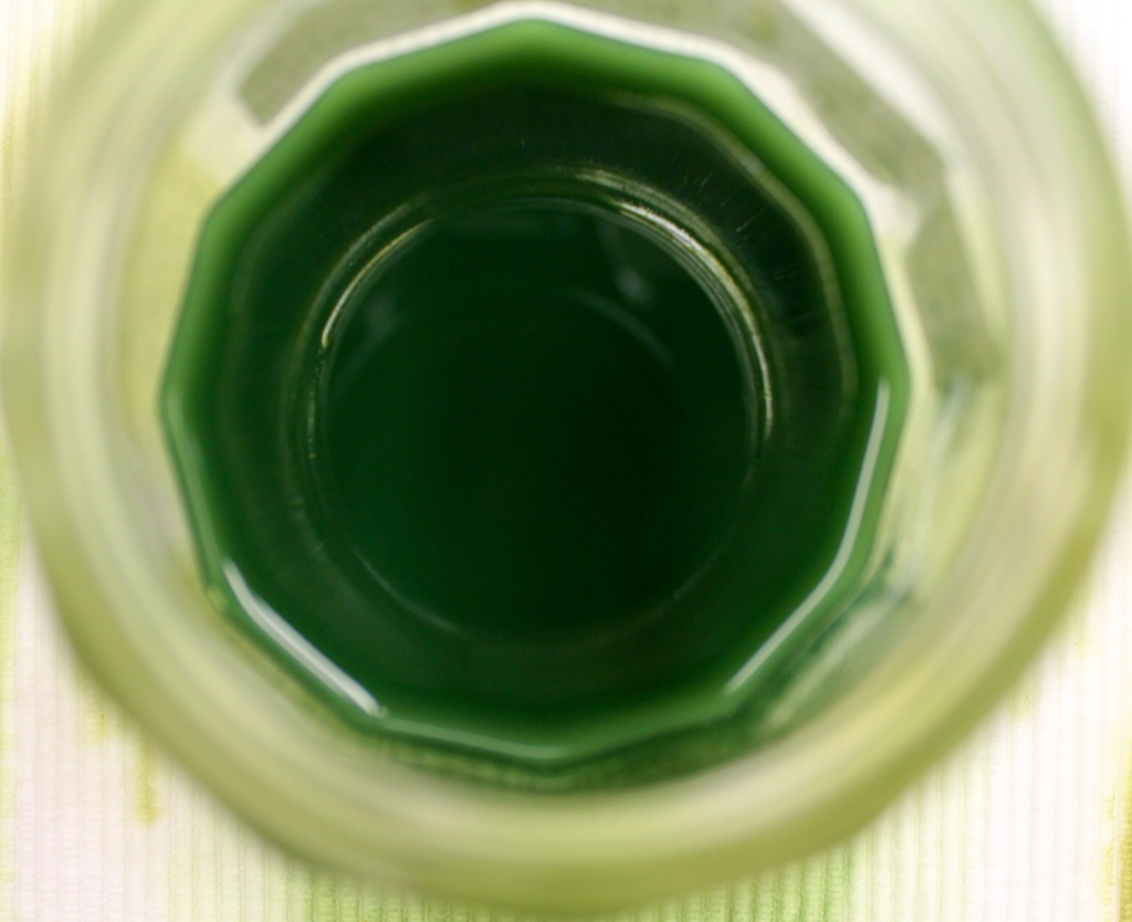
Using a huge array of powdered pigments originating from all over the world and obtained through Kremer in New York , KAMA in Montreal and some made by Genevieve herself, the class created thirty-three samples of paints in yellows, reds, blues, browns, greens and oranges. We used gum arabic as a binder to make watercolour paints from the pigments; we also learned how to make egg tempera paint with egg yolk and pigment. No tap water but demineralised water should be used to make the paints when water is required.
Genevieve has made efforts to obtain the pigment powders from their places of origin. It was not always possible for sometimes the supplier did not want to reveal sources…In the future she hopes to make her pigments starting from scratch using the soil, the rocks, the plants, etc. But she cautions that steps must be taken to ensure that pigments made directly, e.g., from clay, must be made free of impurities that can cause mold growth, etc.
After each paint sample was mixed and made ready, we entered the colours in the chart:


We learned that painters of the day did not blend colours together but used them pure.
 
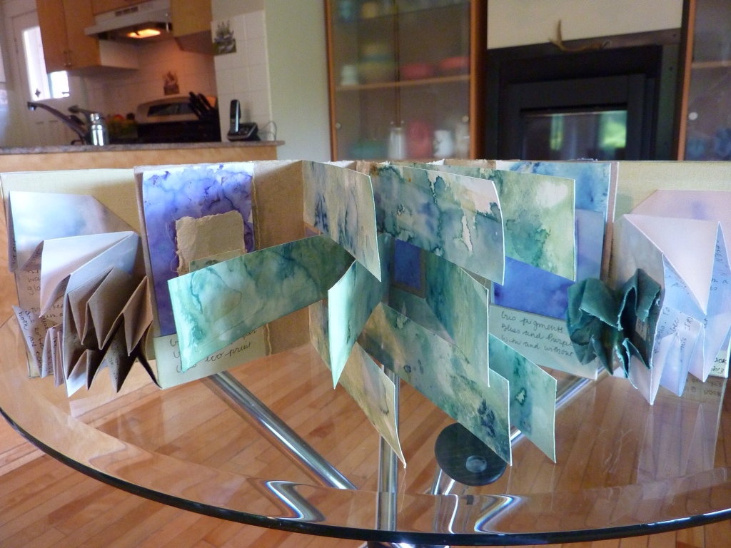
For each student to take home, Genevieve had prepared in advance a set of thirteen pigments of the above colours in small pans in a watercolour tray:
 
 
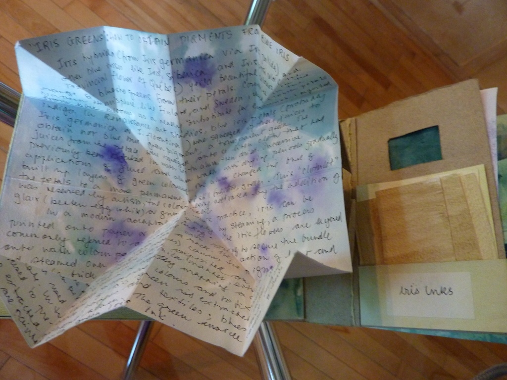
As part of her presentation on pigments derived from plants, Genevieve asked me to share the results of my iris clothlet experiments previously reported here
 
Painters carried their pigments in white shells like these below because the colour of the shells enhanced pigments so that they “read” correctly. Genevieve showed images in medieval paintings of painters using shells for their pigments.
 
The top row of shells contains alum and iris pigmented linen clothlets soaked in Gum Arabic (L) and glair AKA egg white (R), with resulting colour; the shells on the bottom row contain clothlets without alum.


Tips, Tricks and Gossip a la Renaissance Pigment class
 
Genevieve is a warm raconteuse and tells flavourful side stories to keep us working while we mix and grind our pigments. Some examples to share:
 
– Renaissance painters and dyers were often a cagey lot. We have lost a lot of useful knowledge because of this tendency to keep trade secrets but at least it keeps conservators employed… Trade secrecy is maybe an issue sometimes today, too…
 
– One “secret recipe” for a dye process contained nasty inclusions like rancid fish oil…We wondered if this ingredient was early “disinformation” in action: the release of sketchy info in the hopes that a competitor would steal the process and suffer loss of business as a result…We speculated suspiciously that we know people can give out their pie recipes but with something missing or a false ingredient, etc…Was that Renaissance dye recipe “leak” like a modern day Wiki-leak? Controversial topics then as now…

– As recently as the 1980's in France, women conservators at the National Library were permitted to carry out only the first steps in restoring bindings. They had to pass the final finishing work to male binders and were not allowed to know how to do the males' work…
 
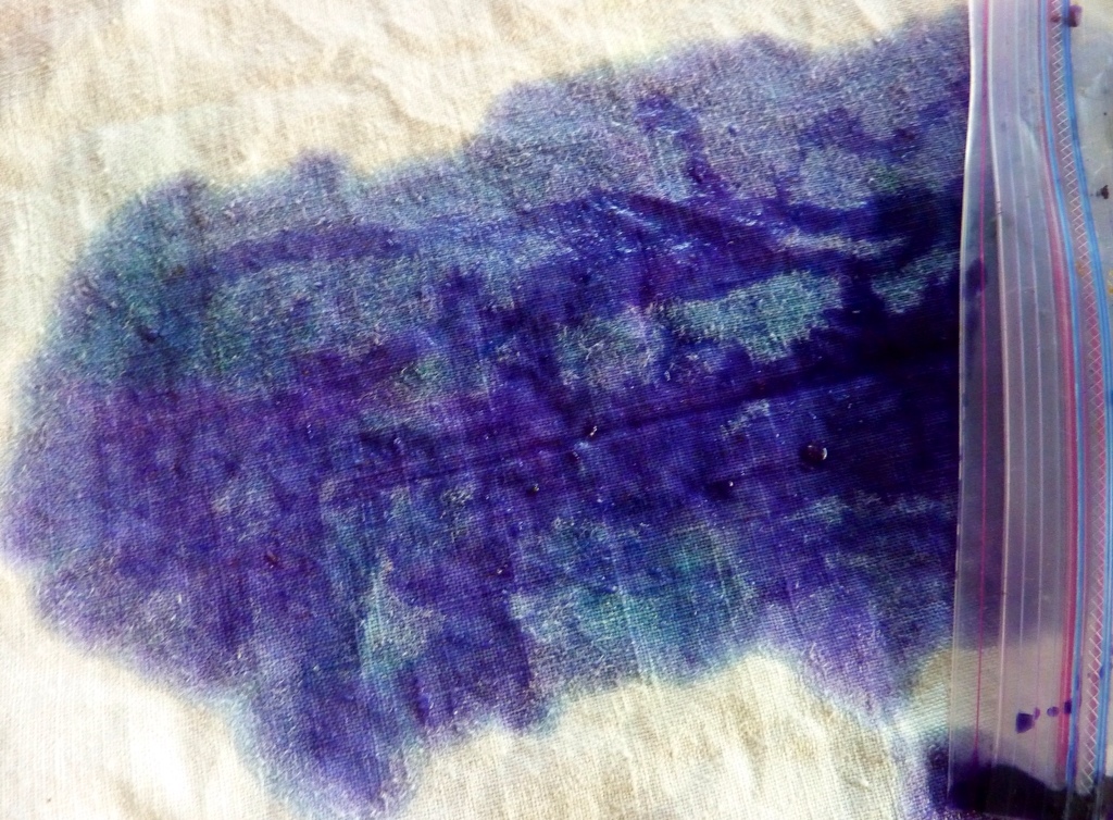
— A tip for preserving pigment “cakes”: Do not keep them in ziploc baggies where they get no air. Either vacuum seal the bag or store the pigment cake in a container that lets in some air.Here is some paint that grew mold in a ziploc bag. Gum arabic can go bad, too.
 
 
– Tips for making egg tempera paint: Use older rather than fresh eggs; the egg yolk is good for one day only – mix pigment with a new yolk the next day.
 
Sharing Knowledge
 
Genevieve gave permission to describe freely the content of the class and to publish photos, as did the other students. She said she would like nothing more than to spread the word about the beauty of these pigments and the fascinating processes involved in making them. As a researcher, she is committed to spreading current or new knowledge as well as restoring lost knowledge.
 
The link below will take you to a slide show on the How To's of Renaissance pigments a la Genevieve Samson:

Genevieve's email address:
 
gensamson27@gmail.com
 
End Note
 
The Fleur de Lys (“Lily Flower”) forms part of the Quebec provincial flag and is a design long associated with French history and culture in France and in Quebec. It was used in France at the time of Champlain. Its origins as a symbol go far back to the sixth century when King Clovis of the Franks adopted it in his banner. Did he intend to call this flower a lily, which is the strict meaning of the term? The symbol is pretty obviously not a lily at all but an iris. Perhaps he, as a native speaker of a Germanic language and not French, as a soldier and a conqueror, would not have worried too much about correct French plant identification. What did it matter, lily or iris? I think what most likely mattered was that this flower shows a tripartite separation of petals and in religious imagery, could have been a apt symbol of the Holy Trinity for King Clovis, a new convert to Christianity.
 
The adorable little lapel buttons below have clever designs within the Fleur de Lys form, demonstrating aspects of Quebec French culture:


Next post: What's new in the garden for eco dyes? And yet another stage in the Iris Camino.


Iris Dyes, Inks and “Clothlets”

This is my third post about the colours obtainable from the Tall Bearded Iris (Iris hybrida, I think). Photo below:

When the bloom begins to fade, it starts to turn to mush, and dark blue pigment drips from it:
Large juicy drops fall on your table and drip blue stains:
Can we get blue dye, then, from iris? The answer is yes and no …or it depends…
Medieval painters and manuscript illuminators used iris petals for green pigment, not blue. Iris colours had a reputation for being fugitive and eventually, other more reliable greens were developed. The medieval artist's usual method for working with iris pigment was to make a “clothlet” , a small piece of linen that acted as a portable resevoir for the pigment. The clothlet was soaked in alum water, dried, then iris juices were squeezed onto the cloth which was then dried again. This procedure was repeated several times until the pigment built up. To use the pigment, tne artist placed tne clothlet with prepared egg white (“glair”) in a small container such as a seashell. (Love that touch! ) The pigment would leach out into the egg white and make a transparent green suitable for painting. (See Daniel V. Thompson: “The Materials and Techniques of Medieval Painting”)
Here is my interpretation of the medieval method for obtaining iris colour. I was hoping for blue as well as green, so I decided to try for colour both with and without alum (alum permits the iris greens to emerge.) First, I collected and froze the blooms in ziplocs for a week or so until the bloom season was over. A defrosted iris gives a lot of juice!
 

I prepared two pieces of linen: one soaked overnight in alum and water, and one without alum. Green colouring occurs with alum while blue occurs without alum. I had enough frozen iris to apply juice three times to each linen clothlet. As each layer of pigment was applied, the colours became steadily deeper.

The blue stayed true blue on linen without alum as mordant, but it also separated out into purples and greener, turquoisey blues:

The alum cloth looked turquoise for quite a while between iris juice applications:

The next to last application of iris juice created these colours: the alum cloth (right) is still in the tirquoise green range.

After the final application of iris juice: Even though the photo colours are somewhat “off” , we see a change to much deeper greens in the left-hand clothlet and a shift to greyer blues on the right (not really purple as shown.)

A conservator friend will be giving a class in July on medieval pigments especially the use of ochres, and I plan to attend. She has asked me to prepare some iris clothlets for the class, so I will not have the results of this iris dye project until after the class on July 6. I am keeping the clothlets until then without using them for pigments to paint with.

Meantime I have tried some other ways to obtain colours from iris.First, the greens:

Iris ink combined with gum tragacanth.

The ink was prepared by simmering fresh iris blooms in alum water in a crock pot until the liquid reduced by way over half. Then I mixed half ink and half gum trag to make a green glaze. I left most of the rest of the ink as a straight liquid.

The ink, as is.

Iris Surprise Sludge from cooking up all the irises previously used in my steamed bundles (previous posts) and experimental solar dye jars.

The spent irises had an amazing amount of colour left in them. These blooms behaved quite differently from the fresh ones. They took a long time to colour up in the crock pot, several hours. After sitting overnight to cool, greenish sludge formed at the bottom of the pot with some greenish liquid separated on top. I poured off the liquid and put the sludge in a jar in the fridge.

Here is what the colours looked like on cotton and watercolour paper: the paper colours captured here in this photo are too yellow to be true. They resemble the colours on cotton in fact.

I painted some iris sludge onto watercolour paper along with some sludge from lychee hulls (Why not? )
Below: Iris colours glazed onto watercolour paper:
The greenish tones are iris, the tan tones are lychee. Note the glazing effects and the colour variations as a result of overlapping glazes. The sludges act just like acrylic medium. They are thick, shiny, sticky and dry fast! Plus they are transparent. Not sure how one gets sludges on purpose, though. The lychee hulls, unlike the iris blooms, had not been used for dyeing things already.


And last note:Iris turquoise greens can dye synthetics. My Carpal Tunnel cuff is well stained ..we will see in day or two how fugitive it that dye on polyester!


Next time: more iris colour notes and some notes on dyeing with earth ochres. And if you read Fiber Art Magazine, this month will have my article about some eco dye artists who are taking their printing and dyeing processes to the next level.

A quick update on this post: Here is the info for anyone in the Ottawa region or elsewhere interested in taking a class from Genevieve Samson, conservator at the National Archives of Canada on the palette of Renaissance artists. This is the class for which I have prepared the iris pigment clothlets reported on on my recent posts.

http://www.artpontiac.com/artschool/2013summer/A3-GenevieveSamson-Palette.html