August prints from native plants: Virginia creeper (Parthenocissus quinquefolia)

Eco dyeing and printing are seasonal activities for me, closely tied to my garden's rhythms. Late summer and early fall in AgCan/USDA zones 4/5 is a period rich in accumulated plant pigments. Even though eco printing as a technique relies on the knowledge of tradional dyeing, it does not always turn up the same pigments in the dye pot as do the traditional “whole cloth, dye bath” techniques for dyeing fibres.

Furthermore, due to the nature of the eco print processes ( bundling, stacking, steaming, composting, tying, solarizing, etc.) , more than one colour may show up from one plant on a dye printed surface. This happens when the eco print processes force pigments in the plants to separate out into constituent colours on the surface of the substrate. These colour differences can often lost be when the plants are processed to extract colours by first heating them in water in a pot to make a dye bath, then processing the fibres in the dye bath to take up the colour.

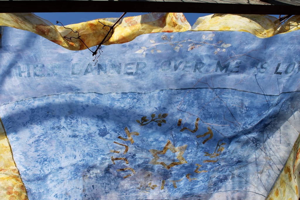
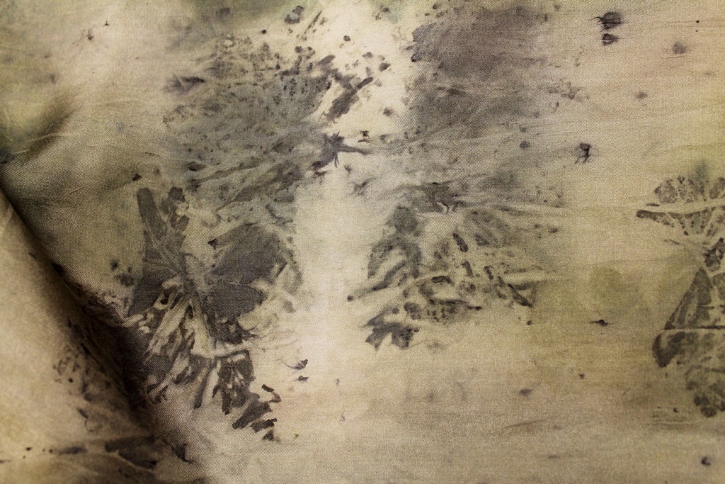
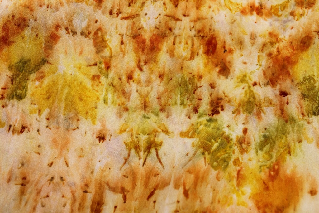
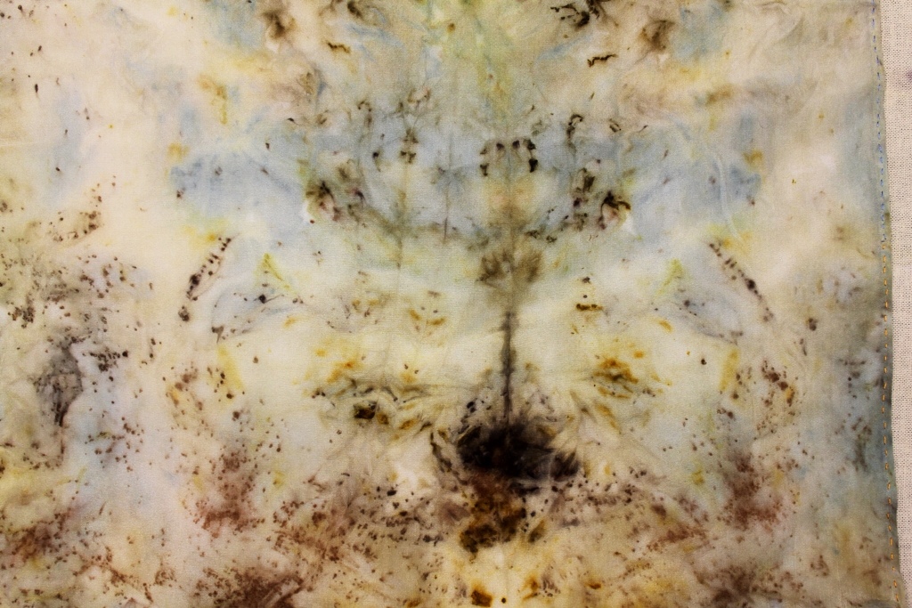
I like to approach my print surfaces as if they were abstract compostions; thus, I am concerned with the interplay among colours, forms and field. The second image (rather far below) shows silk crepe de chine eco printed with a selection of native plants from my garden last week: a background lightly coloured pale- ish yellow by just a tad of goldenrod ( a few sprigs removed from the tops), a lot of coreopsis verticillata (the whole plant in bits) to give small, varied and strong red-orange marks, the blue-black berries of Aronia melanocarpa ( black chokeberry) smooshed on to contribute blue, purple and lavender areas to the field (plus the darks and lights of analagous colours, as does the coreopsis), purple sandcherry leaves for deep teal greens (not shown), and on the right, a Virginia creeper (Parthenocissus quiquefolia) leaflet in its red fall colours – but scarcely any eco print from it.

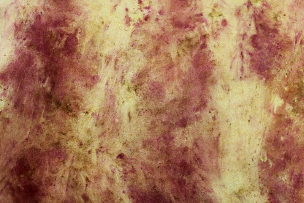
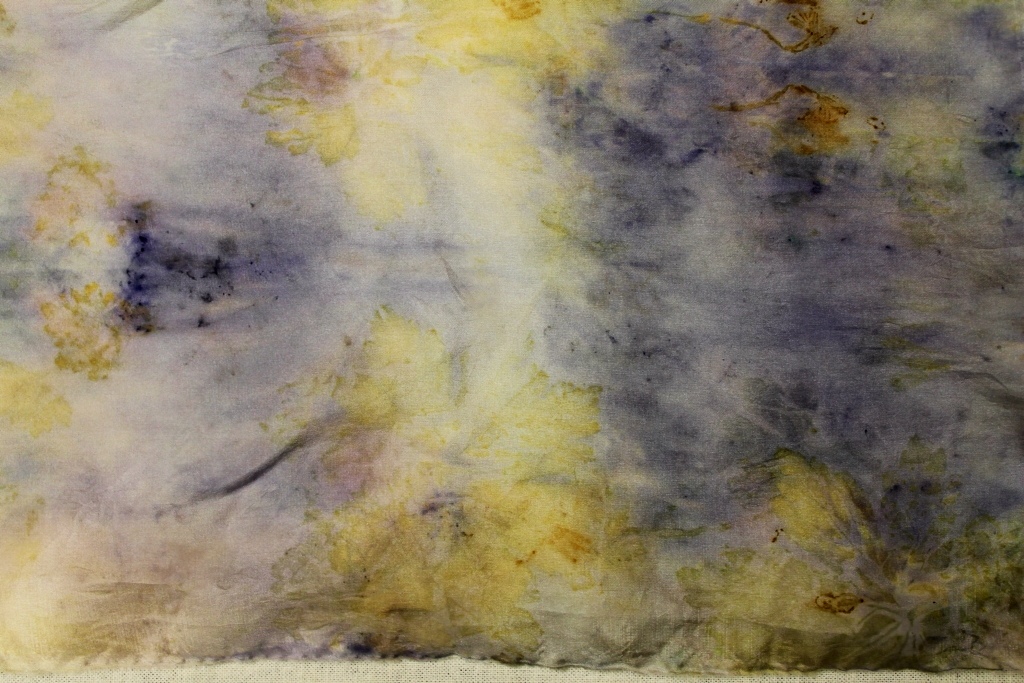
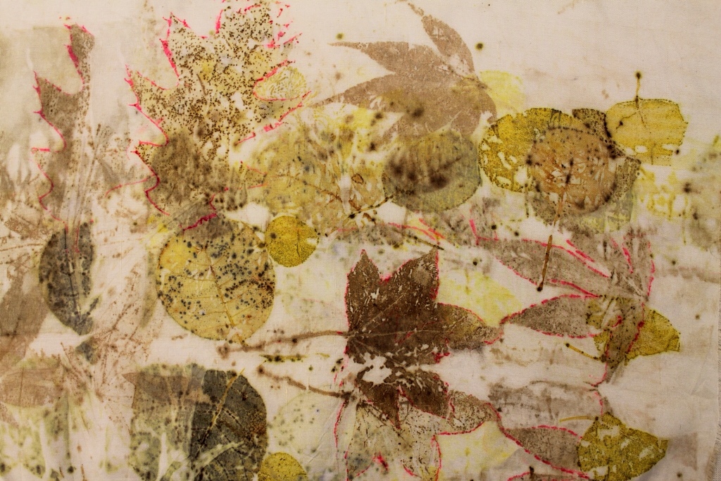
This image right below shows coreopsis (red and oranges) and red cabbage (blues) on silk. The colours and distribution of forms across the field of the textile reminded me of flower paintings by Seurat and Odilon Redon- along with the orange-blue Impressionist fave colour combos. Playing with the dye outcomes is for me the most fascinating part of contact printing with plants

Back to the Virginia creeper (VC)

VC, a native vine, is not much used in the traditional dye pot, as far as I can tell. It seems to be a kind of Bait and Switch plant, flaunting spectacular red and purple fall foliage, adorned with rich bunches of black berries that birds devour; but it appears to be a Tame, Timid and Stripeless Tiger in the trad dye pot. Adrosko, Cannon, Casselman and Dean (to mention some Big Trad Dye Names, see my References page) make no mention of VC as a dye plant. Other sources do mention it but without enthusiasm: Richards and Tyrl in their book on on North American dye plants have it classified in their chapter about plants that give little or no colour, noting only a pale yellow-cream. ( I guess that is the chapter every poor dye plant dreads to be consigned to… But take heart, Virginia creepers. Eco printing is your friend.)

Daniel Moerman (in “Native American Ethnobotany” ) writes with erudition that the Kiowa Indian tribe (in Canadian usage: “First Nations” or Kiowa native peoples) obtained pink dyes from VC berries to colour feathers used in war dances.

The notion of long-term “fastness” is not generallly addressed, other than to recommend the use of the Usual Suspects as mordants. I suspect tannins and iron might help VC colour up in an eco print process more than in the trad dye pot.

The only really hopeful discussion about potential eco print colour from the VC appears in a 1986 publication entitled “Dye Plants of Ontario” from the Burr House Spinners and Weavers Guild ( see Reference page). The guild tested the vine for dye potential, using the whole plant, having gathered it in November and noting: “This vine is not known as a dye plant.”

With alum as mordant , a 6:1 plant-to-water ratio and 45 minutes in a simmering dye bath, the colour given is “butterscotch”. Other mordants were as follows: with copper, a rich tan; with iron, a golden tan. As a modifier post-dye bath, iron gave deep bronze; ammonia, a bright golden tan. Summer foliage gave ivory with an ammonia rinse, and olive greens with a vinegar rinse. No longer recommended as mordants are tin and chrome though the Burr House dyers did report their experiments with these.

Thus, with this info In mind, I plan to experiment further with the Virginia creeper as it matures in my garden and in the environs.

And after all that “learned” text above, I expect, Dear Reader, that you will be wondering when your author will finally put up the Eye Candy.

Here it is:


The red leaf on the right is one leaflet of the five leaflets ( the “quinque” in quinquefolia) of the Virginia creeper. But hardly any eco print at all. The reds and purples came from coreopsis and aronia berries, though of course, one could be forgiven for hoping the VC had printed thus. But we know that what we see in a leaf is not what we necessarily get on an eco printed substrate. (And I think snails ate the holes in the VC leaflet – the vine was covered in snails. )

Next, I will mess around with tannins and iron to see if an eco print can be coaxed out of the Virginia creeper. There were no iron bits, bark or tannin rich plants in the bundle shown here. Of course, I am just guessing that we could get a print from the VC in the environment of these mordants/dye assistants. TBD.

Inspiration for this post

Thanks to the edltor of the Journal for Weavers, Spinners and Dyers who asked me about fastness of dye in the Virginia creeper. That question became my research topic for today, and led me down this most interesting rabbit hole. I have been planting lots of the native Virginia creeper this summer to attract birds, to give fall colour, to cover the tattier parts of our fence and to give privacy. Perhaps VC leaves can make an interesting eco print, or perhaps the VC berries can dye some war dance feathers pink (gonna try for those pink feathers for sure but maybe will weave them into the garden loom instead of my hair. Turn swords to ploughshares, kind of.)

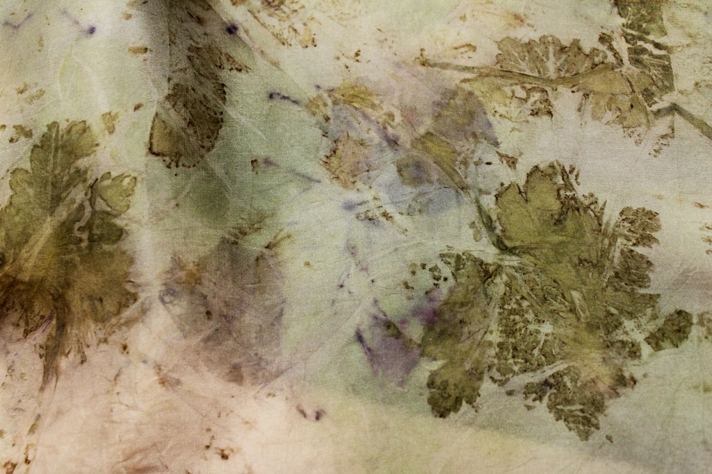
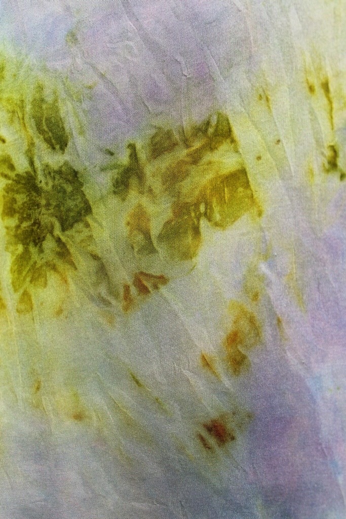
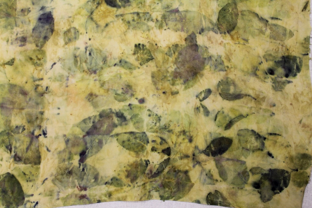
Meanwhile, here is a taste of some more Eye Candy in relation to future posts about dyeing with native plants. The next post will be about eco prints on silk with other native plants from my garden. See if you can guess the plants printed here:


Hints: Walnut, coreopsis, sumac, aronia berries, rose, cotinus, goldenrod, purple sandcherry.


Until next time


Wendy


Books, boxes and eco prints

Time to catch up on reports about studio work! Where did July go? Well, this month took me and Husband on a new adventure. We have sold our house and have (almost) bought another, much smaller and with a much smaller garden…so lots of work ahead of us, sorting and recycling and, O Lord help us, DESTASHING…But somewhere in between the house selling and house hunting I managed to fit in some July eco prints – for the good of my soul and my sanity – challenging myself to work with wool, (What a great distraction from the Task At Hand…) Thanks to the generosity of James Dennison, eco printer extraordinaire, who sent me some wonderful pre-felt yardage (second-hand wool is hard to come by), July did not pass without an eco print or two…

To start:, A coiled pre-felt: the coreopsis leaks red…the strings were iron-dyed and made their own marks:


Three pre-felt fragments, printed with Black Walnut, Golden Rod, Purple Sandcherry, Coreopsis, Rose and Sumac:


Detail – greens, blues and teals from Prunus cistena: red from Coreopsis verticillata, yellow from sumac and Golden Rod:


A little silk habotai with coreopsis and Purple Sancherry:


My friend Carmella Rother, a felt artist, tried eco printing for the first time on her felted and embroidered merino. We had a fun session at my studio, with many lovely results. Even a first-time “student” print can succeed beautifully, as you can see. Carmella is captivated! She is now experimenting with eco prints on her felted vessels


Here, coreopsis and rose leaf with iron bitsmon felted merino:


String embossments on felt with eco prints (Purple Sandcherry)


Sumac and Purple Sandcherry on felted merino:


Sumac, coreopsis, Red Salvia blooms on embroidered felted merino:


Native plants for eco prints: Monarda, Golden Rod, Coreopsis, Black-Eyed Susan:


…Book Report

My books arrived back from the July Canadian BookBinders and Book Artists Guild National Show in Calgary.

A Blizzard Book (Hedi Kyle design) with soft cover: clamshell case by Shlomo Feldberg. Eco printed with maple and rust.


New World Scroll: Acer Saccharum. Eco printed papers, bookcloth, embroidered. Slip case by Shlomo (Book and box covered by eco printed papers and cloth)


Coptic binding; rust and maple printed papers; maple-printed linen covers (iron-dipped):


Rust printed and embroidered cloth; rust and maple printed papers:


That's it for now. Next project is to install a small show of eco printed Artist Books and prints at the Ottawa School of Art on August 12. The Iris Green books and prints will be part of the display as well as other books, including the ones in this post.

I will be giving a class in eco printing on paper at the Ottawa School of Art August Fri 23 Aug evening and Sat 24 Aug, for the day.

Hope to have some more student prints to share after the class!

Wendy


Assembling the Chuppah: Almost Done

“Chuppah” means “that which covers or floats above ” ( cf. The New Jewish Wedding, Anita Diamant)

Silk organza and silk chiffon float nicely but they are not so easy to sew. Boy, do they slip and slide and stretch… and float away from your fingers. I cast my mind back to Needlework class at High School in England and to Sister Mary Joseph, our Needlework teacher, and all my wonky lapped, French and Run – and – Fell seams. Sigh. Indeed lovely. But time consuming. Could there be a less ” Slow Cloth” solution?

I tried a “short cut” to a faster cloth. What if I laid the textiles out on the wood floor, stuck it down with low tack tape and used the straight joints between the wood boards to true the fabric and to align the seams?


Not every “What If” works. All I got from this one was more wonky seams, just as in Needlework class. Several hours, some Avoidance Activity ( will report later on this) and much really picky seam unpicking later..

I was ready to heed Sister Mary Joseph’s advice: “Tack them in place first! “

It took me quite some time to baste four 72″ lapped seams but this is Slow Cloth and it was worth it. I even enjoyed it. The eucalyptus print panels were lapped to the Red Cabbage print overhead canopy after seam edges were zigzagged to reduce fraying/ and straight stitched for easy folding; then the seams were machine stitched flat. (I think the US for Sister Mary Joseph’s term is to “flat fell” a seam)

Next was the applique of motifs on the canopy. I had some misfortunes with the lettering on the canopy roof. For the English verse “His /Her Banner Over Me Is Love” I used very old fusible and so the letters peeled off after a few days…another lesson learned. For the replacement letters, figleaf motifs, Hebrew letters, Mogen David and Olive Branch appliques, I switched to new Steam A Seam Light. It took a couple of extra days to re-do the lettering but the results were satisfying.

Lettering lower left.


An Olive Branch entwines the letters on the canopy:


Fig leaf motifs in five layers of silk organza for the four corners of the chuppah, strong enough to support the poles and the canopy:

With a soldering iron, I burned holes in the fig leaf motifs for the screws on the finials to pass through, then fused the fig leaf “patches” to the corners of the chuppah.

The finial in place. We found the poles and finial on sale in the drapery department at a local fabric store


This house plant provided the template for the figleaf. Can you see a fig?


Remember the recent Red Cabbage experiments? These lovely blues and turquoises are now part of the chuppah.


All of these printed textile fragments are to be incorporated into the final phase of the chuppah construction as long ribbons or fringes attached to the poles at the corners. The ribbons go in groups of eight on each of the four poles to signify fringes, as on a prayer shawl.

Here are some of the ribbons in progress. The Red Cabbage blues are combined with fragments of other eco printed textiles in co-ordinating colours. The yellow silk is Golden Rod, the dark one is tea and rust printed, the light is a eucalyptus print, the blues are Red Cabbge.


The edges of the chiffon and organza ribbons need restraint and a narrow zigzag does a pretty job of edging. For readers cringing at the very thought of how long it might take to zigzag around 32 ribbons, 72″ long:

SURSUM CORDA! Lift up your hearts!

It took me ten minutes to make one ribbon after cutting it out: so six minutes to sew one ribbon, two more minutes to iron it and another two minutes to trim off the “beards” with my trusty little Fiskars snips. Add five minutes as guesstimate for cutting, so fifteen minutes per ribbon times thirty- two.

Thus, four hours to make the ribbons ONCE the printing is done…and the amount of time for eco printing is another story…Slow Cloth indeed.


Finally, here is a pic of part of the chuppah in progress with lettering and leaf motifs in place. The blue of the sky today (it was a ridiculous 80 degrees F here in Ottawa!! ) and the blue of the silk roof of the canopy look almost the same. That was the idea- for the Bride and Groom to look above their heads, for the canopy to disappear almost against the sky and see only blessings on their wedding day.


Last pics of the chuppah before the wedding will be to show the ribbons all done and the 16 small “buntings” or “prayer flags” in place. After the wedding (first weekend of May) I will post pics of the finished textile.

Next post: Avoidance activity: eco printing with blue hyacinth

Eco printing the chuppah 5

My garden (the one the Bride grew up loving, but, er, not actually ever having worked in) has supplied all the plant materials (except Sweet Gum and Japanese Maple) for this collection of eco prints which were completed mostly last summer and fall. Some dried and frozen plant materials have been printed this winter. The USDA zone for an Ottawa garden is 4 while Canadian zone classification puts it at 5A, so taking garden micro-climates into account, one can make reasonable guesses about the range of dye plants comfortable here.

Sumac berries bundled in silk habotai


Rose leaves and tagetes marigold on lichen dyed vintage kimono silk fragment

Perennial geranium on silk habotai
Perennial geranium on silk habotai, modified by iron


Coreopsis verticillata (reds)and tagetes marigold calices and petals (greens and yellows) on silk habotai

Perennial geranium (yellow-greens), Golden Rod (yellows) and Red Cabbage (blues) on rusted silk habotai
Red Cabbage (blues) and tagetes marigold petals and calices (oranges and greens resp.) on silk habotai
Orange pekoe tea (blacks and browns), rooibos tea(rusts), safflower petals (yellows), Red Cabbage (blues) on silk habotai. All from the grocery store.
Purple Sandcherry and Purple Basil on silk broadcloth. Blues and greens.
Oak, Japanese Maple, Sweet Gum, Cotinus Coggygria (dark greens) and eucalyptus cinerea “Silver Dollar” (yellows) on silk broadcloth. No idea where that pink came from.


Note on the colours: I used a Canon Rebel SLR set at fully automatic, then the “enhance” in iPad photo edits. I find the colours very true to life.

Next time: If my new computer arrives this week, I can share some pics of the garden from last summer and fall. It is hidden under snow right now.

More eco prints with golden rod, marigolds and maple leaves on vintage linen

The fields and ditches of Ontario were yellow with Golden Rod in late September. How not to pick some? A trip of some 700 kilometers and acres and acres of gold like this to look at:

 An armful of Golden Rod gathered from beside the road and a potful of (park) marigolds, deadheaded, gave  plant materials for immersion dye baths as separate colours and mixed. Most dye authors advise that it is OK to mix any yellow dyes and so I tried it with my vintage tablecloths described in these October posts. I wanted to try eco prints on both coloured textiles and white ones. So far, I have eco printed only naturally dyed textiles, the ones I have dyed myself using garden or foraged plants.

Golden Rod can be used a few times to extract dye. This batch of linen was dyed with a mix of marigold and golden rod colours. For one contact print with the Golden Rod plant, I first dyed the vintage linen in a long cool soak in a Golden Rod/marigold mix dye. I left the cloth for two weeks in the dye bucket while I was busy with an art show.  Then I used the cooked Golden Rod material for the contact print. For a second contact print on another vintage cloth, I laid out fresh Golden Rod on white linen :

 After dyeing and /or eco printing a couple of times with the Golden Rod, a began using maple and other leaves to obtain another layer of prints:  there are lots of images! They continue to show the linen panels in my “Forest Floor” series:

1. A broken, layered image of a maple leaf. I like the “incomplete” effect. And the white damask woven motifs reflect the light. Another layer of interest to exploit for meaningful content in the art work.

2. Delicate. Ephemeral. Fragile. Like the linen.

3. A transparent effect to the marks in this one.

4.  More broken marks – and a water colour effect

5. Marks of  a  memory of a leaf

6.  Somehow,  a bird flew in…

7. Golden yellow and dark brown marks from a red and green leaf…

8. Swirls of marks. The dark brown pointillist effects are from the Korean pear leaf, wearing red and brown for Fall.

Other marks and colour effects

To some vintage linen panels (dyed and printed as above and as shown in the previous day’s post) I added a tablespoon of iron liquor (rusty nails in 5% vinegar) to shift the colours to grey-green, and a dropperful (dropped here and there on the textile) of copper sulphate (copper pipe bits in 5% vinegar)  to shift the hue towards a brighter green, as in these four examples:

1.Interesting variations – I like the splashes of yellows (copper) and the greying (iron) of the pointillist marks

2. You can see a leaf print in the top left corner…the iron gave the damask a look of well-shone  pewter, a warm , low sheen. Delicious, silky, touchable.

3. Another layer of marks and colour to add interest4. Another view of the previous iron-modified eco print:

Eco prints from other plants

Now an eco print made with Fall asters (Michaelmas Daisies) and red marigolds on Golden Rod-marigold dyed linen: first the dye, then the ecoprint, as before.  Note that the greens (below) are quite different from the green-yellows of the previously- shown prints. These greens come from the calix of the marigold. Rather more green comes from the calix here than orange from the flower petals. Is that because these flowers are day-length and temperature sensitive? In July, the orange is far more assertive than the green. In October, green rules! I understand from my studies that frost-touched marigolds give spectacular colours. I am looking forward to the frost – only for that. The bright yellows in this eco print are from the Fall asters: 

And here are some images of the flowers used for this eco print:

Red mari

…and asters, pink and purple:

“Aster” means “star”

Last pics in this series of eco prints on vintage linen are of oak leaves. Hmm. I will have to try these again and maybe other kinds of oak – these leaves were large and very green and waxy…but I did NOT get a good impression or colour transfer… so that is a fine challenge for future dye experiments. Meanwhile:

Oak leaves eco print

 I photoshopped this image to crank up the contrasts;  it is much less distinct in reality:

More oak eco print on vintage linen, as before, pre dyed with marigold and Golden Rod:

 I used nine oak leaves for the eco print but only two (above) made any impression. Next time, I will ensure that each leaf is in tight contact with the textile surfaces when I steam the bundle.

Walnut leaf eco print on mari-Golden Rod dyed vintage linen (another image photoshopped o improve the contrast):

Last note: Here is the whole “Forest Floor” collection of eight vintage linen panels. During the winter ( o those long cold snowy nights without dye plants to gather…) I hope to  be stitching some of them, taking them to the next stage of cloth as memory and pilgrimage.

Next dye sessions will be with more Fall plants and on silk as well as vintage linen;  some experiments with walnuts;  some eco prints on paper and some preliminary stitch work on the eco printed panels I have done this summer and fall.

Wendy

Eco printing with maple leaves on vintage linen

Some serious stash busting today. Two lovely white vintage damask tablecloths  woven with leaf and chrysanthemum flower motifs entered the dye pots and emerged as new creations.  Maple leaves and walnuts were the main plants I collected today, the nuts for another day of dyeing, and the leaves for an eco print. Here is the grove where I collected the nuts: even though it is Fall, we see hardly any loss of green leaves yet!

Before gathering the walnuts, though, I first had to pay my respects to this venerable Tree Soul in the walnut grove:

Today was maple leaf print day – from the Silver Maple tree in my garden :

I scanned these leaves to show you which colours  I chose  for the eco prints today.  So many colour surprises on the textile later, even when all the vintage linen was treated the same way and the leaves were similar shades.

To prepare my linen for eco printing, I pre -mordanted it in alum as usual, tore my tablecloths it into eight long strips,  dropped the strips  into a prepared dye bath of tagetes marigold and golden rod mixed and left the cloth in the cool bath for a couple of days in the sun to take up the colour. No other heat was applied.

As usual, I strewed the plant material over the surface of the textile, rolled it up tightly over a stick, bound the bundles with string and elastic bands, placed them (two or three at a time)  in the steamer pot over boiling water and steamed the bundles for an hour or so – or until I saw a lot of colour.

In the marigold-golden rod immersion dye bath, I find that linen dyes paler yellow than silk but darker than cotton.  The damask motifs often show darker yellow than the background linen so their pattern become more prominent yet still contributes harmoniously to the overall surface design along with the eco printed leaves. 

Some of the eco prints are very precise clear,  many are diffuse. That is the combination I like best for I an seeking a multi-layered look that communicates mystery, depth, ambiguity, subtlety… More  Monet than Morris. This series of cloths is entitled “Forest Floor”. When leaves fall to the ground in layers beneath the trees of the forest, some retain their forms for a long time while  others disintegrate beyond recognition very soon, in the eternal cycle of birth, death and regeneration. This is the world of insight and feeling I want to communicate in these pieces.

There are a lot of eco print images today – it was hard to choose only a few!

Fall leaves on vintage damask linen:

1. Some Korean pear fall leaves (also red) with the red maple leaves: 

 Green, brown, turquoise, even blue  eco prints!

2. Different areas of the same textile print different colours:

3. The damask motif shows beautifully with the eco printed maple leaf.

4. Layered effects in the eco prints and the damask motifs

5. I find the variety of colours and forms and marks obtained from the leaves is astonishing; thus every area of the textile surface tells a new story and nothing is ever repeated. I suppose the different concentrations of fall tannins in each leaf in contact with the dyed and mordanted cloth is responsible for the uniqueness of each print. 

6. This leaf printed at the edge of the cloth. I like the spotty-dotty effect of the broken surface eco print.

7. Beautiful layering, broken edges, diffuse forms…more Monet, less Morris in  printing technique.

8. The fragility of the vintage textile informs and confirms feeling in  “Forest Floor”

This print recalle a sepia tint photo. Amazing that such a variety of colours and forms appears in the prints despite using the same dye, mordant and textile for the printing surface. Although I do not know that history of the tablecloths…naturally they will have different laundry history that will affect dye take up. Think of the meals and the guests at the table over the years…

Enough for today. More images of maple leaf eco prints tomorrow if I have time.

Wendy

October Eco Printing: Golden Rod and Tagetes Marigold on vintage cloth

My stash is continuing to provide fibres for my dye pots. Stash busting was my goal for this year and that is how I happened on eco printing and natural dyeing. What to do with all those luscious vintage linens and cottons from my ever-expanding hoard?  And as one fibre art friend remarked: And now you have a new stash…

Indeed.

Here is the fruit of one October dye pot: a mix of marigold (tagetes)  and Golden Rod dyes, combined in a bucket and, for a few weeks at the end of September, where it became home to some of my pre-alum-mordanted vintage cloth while I was too busy to dye on the hot plate.

 White to start with, lace-trimmed cotton and embroidered linen – plus a small twist of silk embroidery thread.  Amounts of dye? Whatever!…This is about “What If I try….???”

The colours are three shades of chartreuse with the darkest colour on the (unmordanted) silk thread and the lightest on the cotton. I had to scan the textiles in to get an image close in colour to the original. The scanned image, while much better than the one from my Point and Shoot, still does not do justice to those luscious yellow-greens.

Here is what the dye pots looked like while the cloth was brewing away in the sunshine on my deck:

On the right is the marigold- golden rod mix dye; on the left is the marigold alone. Note the fall leaves on the deck…While I was away the lids blew off the buckets and some leaves fell in the brew…so who knows what they added to the colours?

This is the GoldenRod still in the dye pot, cooked out and left to extract more colour but not drained…note the mould. Some dye authors say to just sweep off the mould and heat up the dye again..which I am about to do.

And here is Mouldy Goldy – the golden rod blooms are still yellow and leaves are still green even after cooking out and soaking, ignored and neglected for more than two weeks. Andf they still smell lovely.

Next post about these linens will show some eco printing!

September eco printing: marigolds, sumac, golden rod and associates

Detail pics of textiles eco dyed and printed this month and late last month. Dye stuffs from tagetes marigolds were plentiful so there are lots of yellows and oranges. Red cabbage, eucalyptus, red sumac berries, fresh bay leaves and golden rod offered interesting  variations to marigold colours. Note that eucalyptus gave a yellow overall (immersion) dye but pinks and reds as contact prints in an eco bundle. See Image # 4, below for the contact print.

1. Orange-yellows from marigold petals, greens from the marigold calix and violet from red cabbage.

2. Mixed yellow bloom eco prints  (anthemis, coreopsis, marigold)  modified with iron liquor (rusty nails in vinegar) by splashing areas. 

 3. Detail: Coreopsis verticillata, dried and fresh, bundled in alum-mordanted silk habotai (8 mm) and steamed for an hour.

4. Detail: Eco bundles with eucalyptus  (pinks), tagetes (oranges) , purple sandcherry (blues), purple basil (blues, purples) and fresh bay leaf eco print on silk.  The burned area? I cooked this bundle in the microwave but failed to wet the plants and the textile sufficiently…the bay leaves dried up fast (they are not very absorbant) and caught fire…NOT a recommended practice at 3 a.m. in the morning…But the series of burn marks all through the bundle looks great.

 5. Detail: Tagetes marigold (oranges ), eucalyptus (pinks) eco print on silk

6. Detail: Fig leaf (blue!) and mixed yellow blooms (coreopsis, anthemis, Black Eyed Susans) for yellow dyes on eco bundled vintage linen. Blue fig eco print? A nice surprise. I do not know the laundry history of this textile-and this is a principal allure of eco printing on vintage textiles

7. Detail: Golden Rod (whole plant) eco print on silk: greens from the leaves; yellows from the blooms.

8. Detail: Eco bundled tagetes marigold (orange from petals and green from calix) and coreopsis verticillata (red-orange) on silk .

 9. Detail: Silk, first dyed all over (immersion dye bath) with tagetes mari for a lighter yellow; then eco bundled and steamed with marigold blossoms to give darker orange areas. 

10. Detail: Eco bundled tagetes mari (deep orange) and purple sandcherry (blue) on vintage linen-cotton mix.

Notes: This vintage linen is well scoured and conditioned for dyeing by its history of much use!  I soaked it in alum and tannin (from sumac leaves) for good measure. Vintage linens take natural dyes better than newer linens because they are well scoured. Linen’s reputation for being hard to dye is perhaps more applicable to linens not previously laundered or prepared for dyeing. Vintage linens with a unknown laundry history will dye in unexpected ways: that is their allure! 

11. This (well scoured, new) silk noil panel was eco bundled with tagetes mari (orange) and purple basil (blue-violet). 

12. Detail: Tagetes mari (orange-yellow), dried rose petals (grey-brown mottling); rose leaf (green) eco bundled in vintage handwoven refectory linen (from a monastery).  The start of some handstitching – more of  that after the garden season is over in  Zone 4, Ottawa, Ontario!

13. Detail: Lost my notes on this textile!  But the greys are likely the result of an iron modifier on a yellow dye – from lichen, maybe,  or even from one of the fruit tree (prunus) barks I tried in the early summer. Sometimes I get too excited to and forget to write stuff down. A lovely print, I think, though.

14. Detail: Silk eco bundled with pear leaf (some leaves turned red early) , tagetes mari and purple sandcherry leaf: Brown-green, yellow-orange and blue-violet prints,  respectively. I like the dotty-mottles on the pear leaf contact print.

 15. Detail: Mixed eucalyptus leaves (from the florist – this is one plant I did not grow myself!) with tagetes marigold, giving shades of yellow then modified with iron to give shades of browns, greys and blue-greys . This is one of my favourites! Thank you, India Flint, for sharing your knowledge about eucalyptus dyes – and everything else. India’s work  (see link in my Blogroll at left) inspired my 2011 summer’s work.


16. Detail: An eye-popping combo from red sumac berries (pinks and reds) on BlackEyed Susan eco print and dye (greens),  in a lumpy eco bundle with silk habotai (8mm). The tiny red berries print little dots and circles and blobs.

More Eco Printing in September

More September eco printed and dyed textiles:

 Collection 1:

Starting at the top: 

1. Purple basil (blue), tagetes marigolds (yellows)  and Black Eyed Susans (greens); 2. Sumac berries (pinks) 3. Eucalyptus (pinks) , tagetes marigolds (yellows) and darker blues(purple sandcherry leaves). Burned,  by accident in the microwave at 3 a.m on a sleepless night. A serendipitous row of marks. 4. Red Cabbage (blue-violets) and marigold (oranges and greens) 5. Red cabbage (violet), purple sandcherry (blue) and light marigold yellow.6. Marigold, dyed,then ecoprinted for varied yellows/oranges.  7. Red Cabbage (violets – and check that fuschia!)   8. Golden Rod (yellows; greens from the eco printed leaf)  9. Pear leaf (greenish-khaki brown) and bay leaf (I have a small bay tree in the kitchen – light green) eco print.  

Collection 2:From the top: First is silk noil, ecoprinted with purple sandcherry and geranium leaves, modified with iron to give greys, browns, etc. Second textile is from the same  large panel of  silk noil ecoprinted as above without the iron modifier. Third is  wonderful dark olive-green -grey on silk habotai (8mm); chartreuse green from carrot tops modified with iron. Fourth is tan-brown  silk obtained from all-over-dyeing with lichen to give rich dark yellow, then modified with iron and baking soda to give tan; then eco bundled with dried safflower petals which I hope would dye red. The safflower petals had a curious effect: they did not give red (or even yellow). Instead they bleached out the tan-brown dye and left hundreds of tiny peach-yellow-pink-green mottled marks like rice scattered all over the tan silk.  (Detail shot later.) Fifth are silk scraps dyed red with deadheaded coreopsis verticillata blossoms. The last silk panel was dyed overall first with lichen (nameless, sorry – I cannot identify it) to give yellow, then eco bundled with eucalyptus leaves for a leaf print (brownish-yellow) ; then modified with iron and baking soda to produce an enticing range of browns and greys.